Atos chooses Biennale
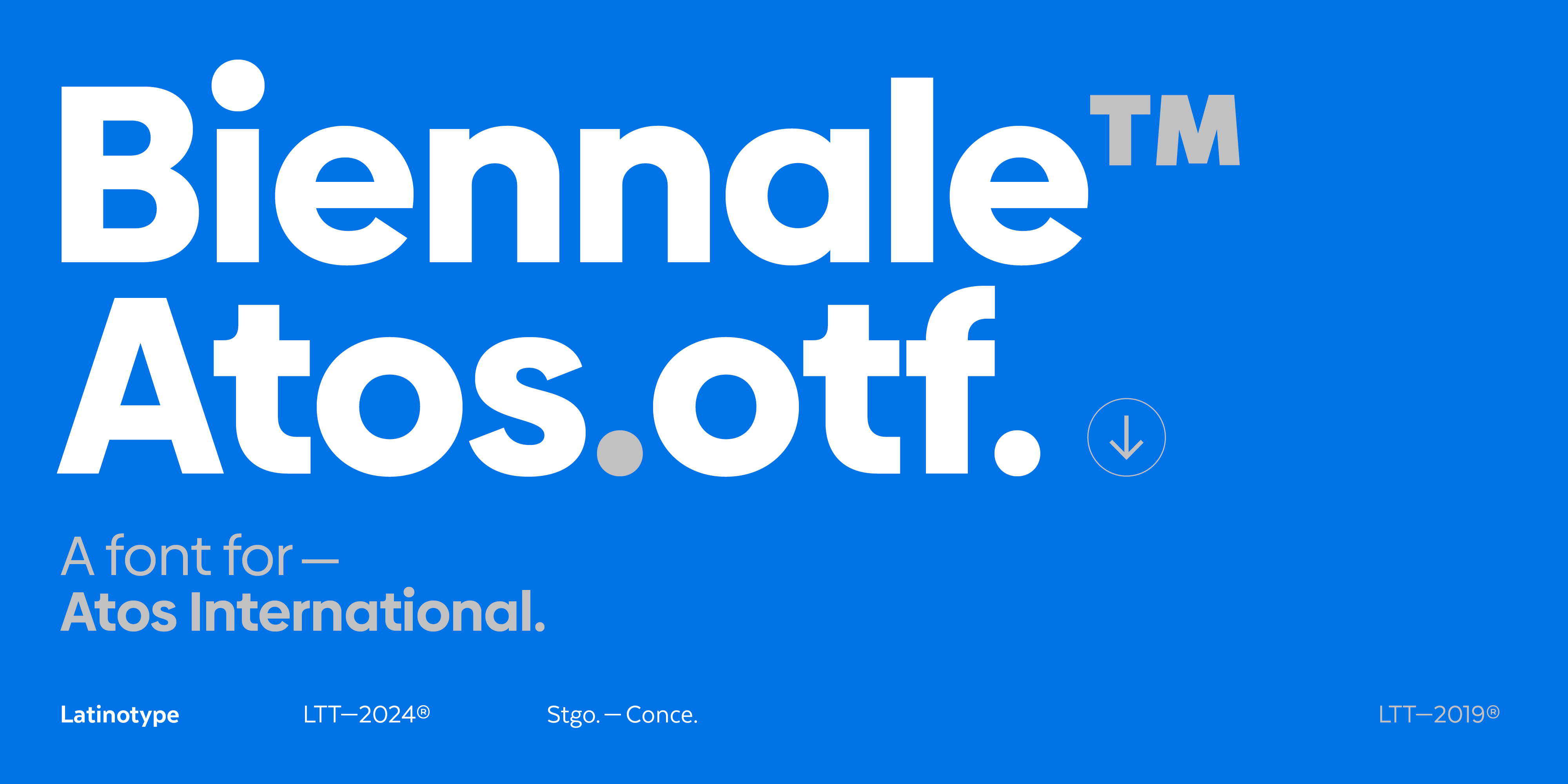
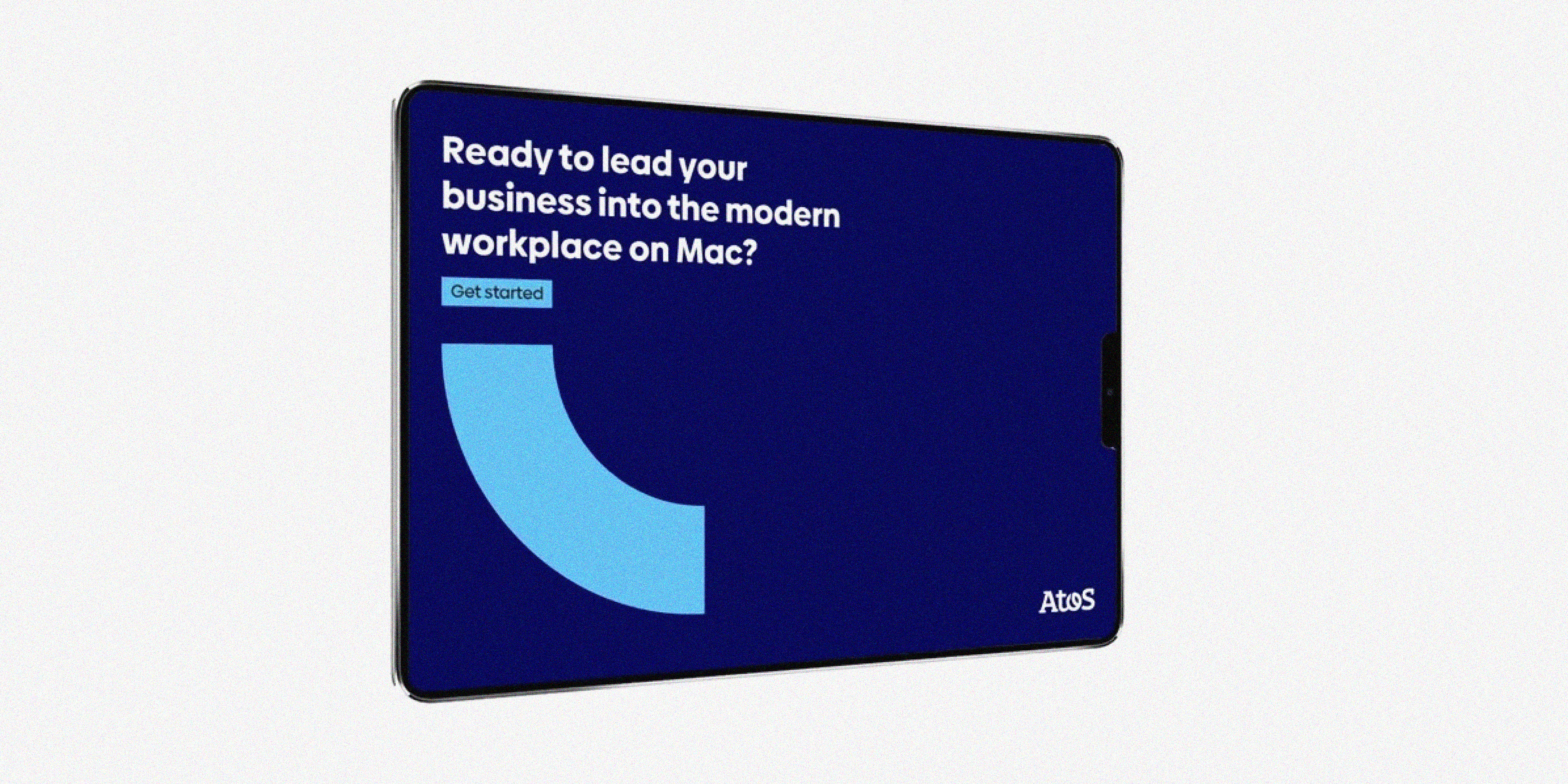
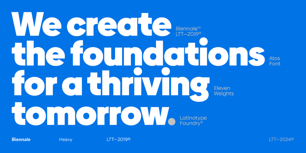
Atos, a digital services company present in 70 countries, Official IT partner of UEFA EURO 2024™ and Olympic Games Paris 2024, has selected our Biennale font, which has been customized by Latinotype to strengthen its brand identity.
With a firm commitment to sustainability, Atos enables its clients, employees, and society at large to live, work, and grow in a safe and secure information space. The choice of Biennale reinforces this purpose by offering modern and effective communication.
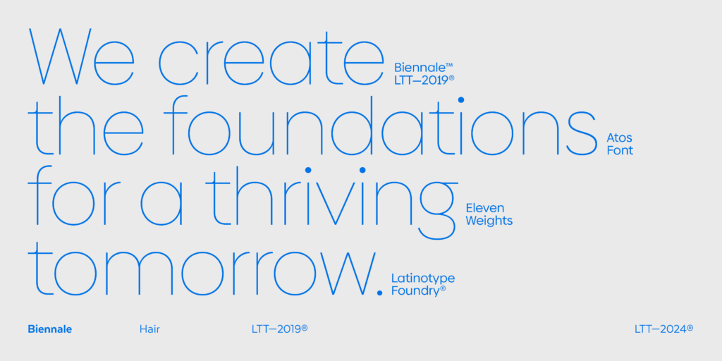
The Biennale font combines elegance and functionality, standing out for its clean lines, balanced proportions, and precise geometric features. These qualities not only provide a modern and professional look but also reflect the security and precision that Atos provides in its information solutions. The clarity and legibility of Biennale symbolize the transparency and trust that Atos seeks to convey in all its communications.
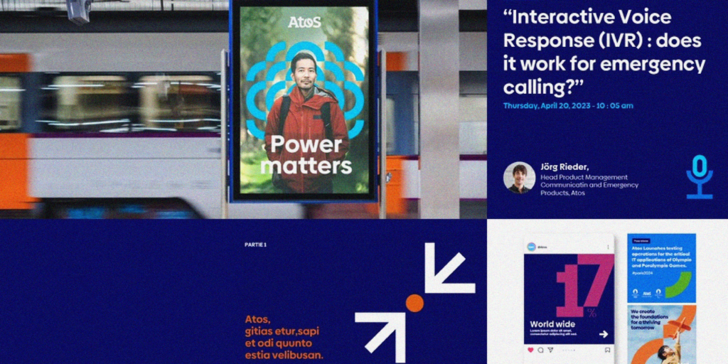
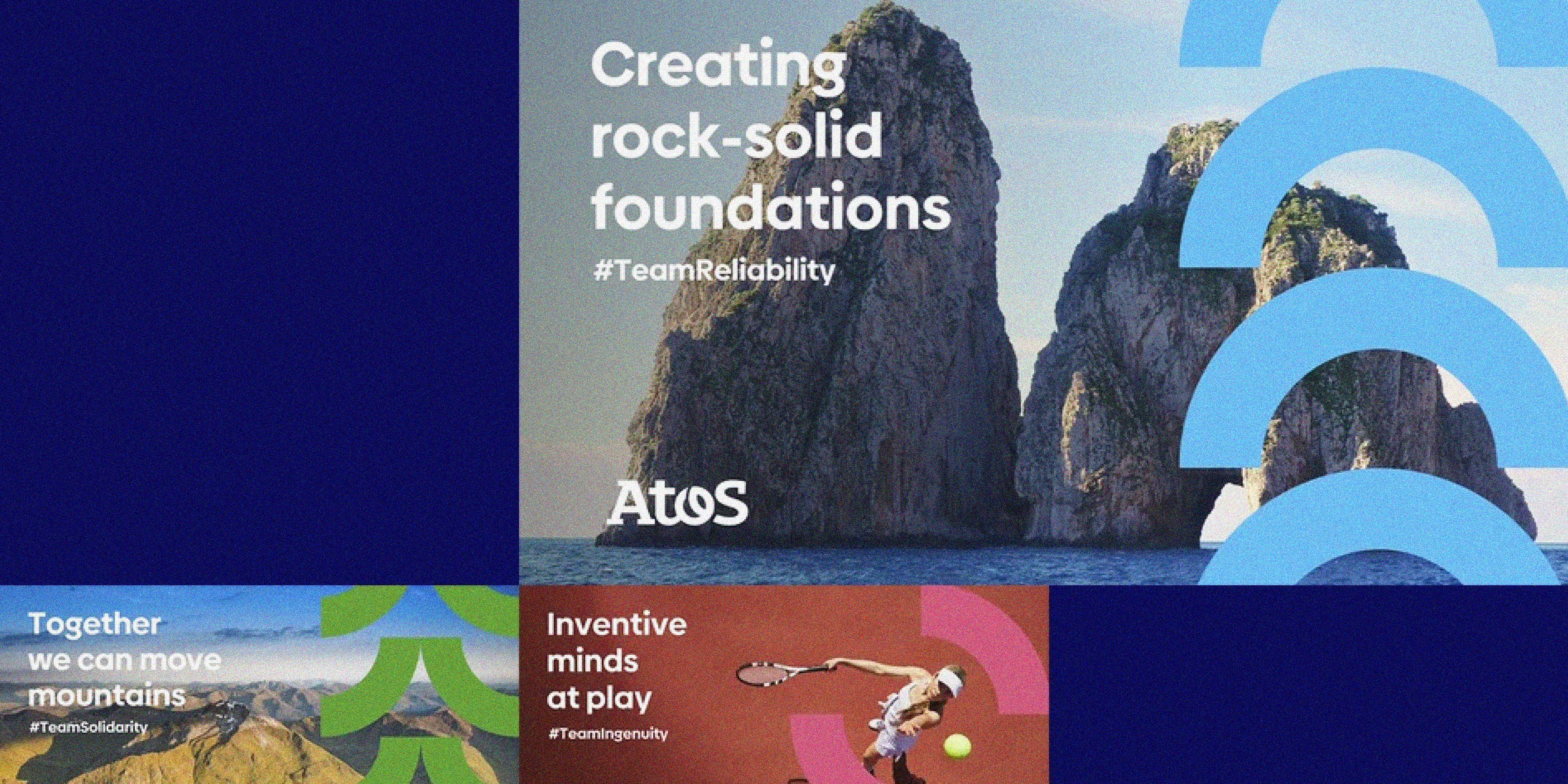
With its wide range of weights, the versatility of Biennale allows its use in various media, from the website and mobile applications to reports and corporate presentations. The implementation of this font ensures a consistent and distinctive brand experience across all platforms, reinforcing Atos’s visual identity.
Latinotype is proud to collaborate with Atos on this initiative, providing a font that not only meets high aesthetic and functional standards but also aligns with Atos’s mission to create a safe and secure digital environment. The strategic implementation of Biennale facilitates more effective and engaging communication, helping Atos fulfill its mission of sustainability and information security.

