Zoom
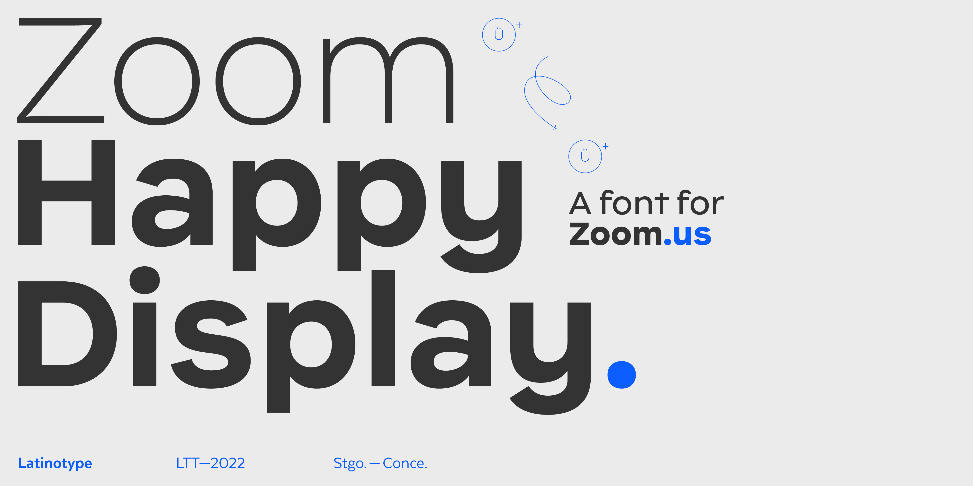
Happy Display, designed for Zoom,
a font that embodies the idea of
21st-century communication.
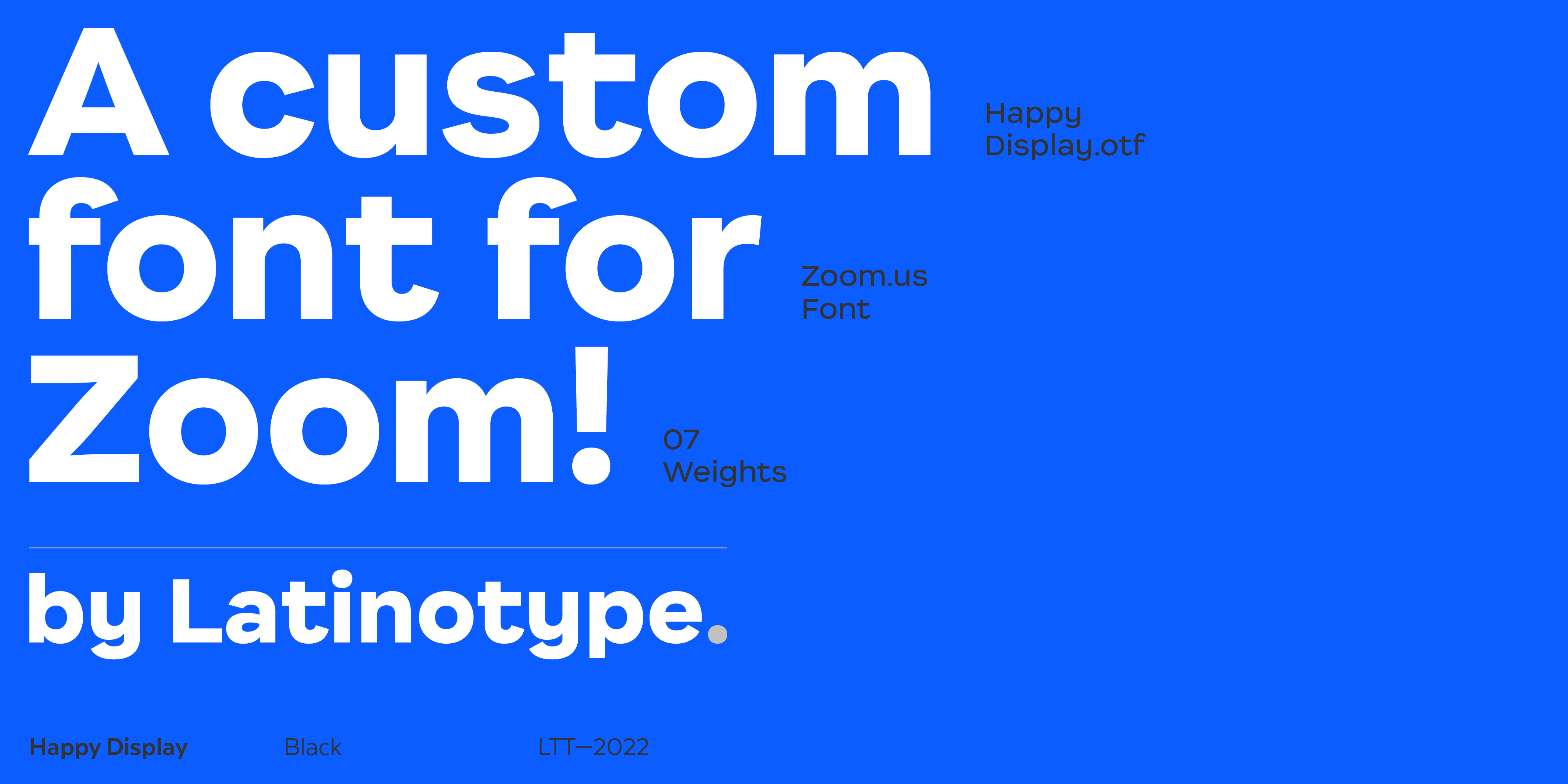
Together with the Zoom design team, we have designed Happy Display, an organic neogrotesque font that synthesizes the joy of communication.
When Eric Yuan founded Zoom Video Communications in 2013, he perhaps couldn’t imagine that over time, it would become one of the most popular video telephony platforms in the world, which would compete as equals with the platforms developed by the mega giants of the technology sector.
The data speaks for itself: an estimated 300 million daily users in 2022 and a presence in more than 200 countries or territories prove the brand’s strength.
A company of this stature and projection dedicated to facilitating communication between people needs a brand that speaks to people in a clear and friendly language. And that corporate communication work is a matter of typography.
Zoom turned to Latinotype in search of a typography that reflected a cosmopolitan, self-assured and close personality.
We worked together with the design department of the company itself and finally created Happy Display from our original International font. And this was the most appropriate idea to start from.
International is a neo-grotesque typeface with organic and fresh air, but it goes to infinity and beyond.
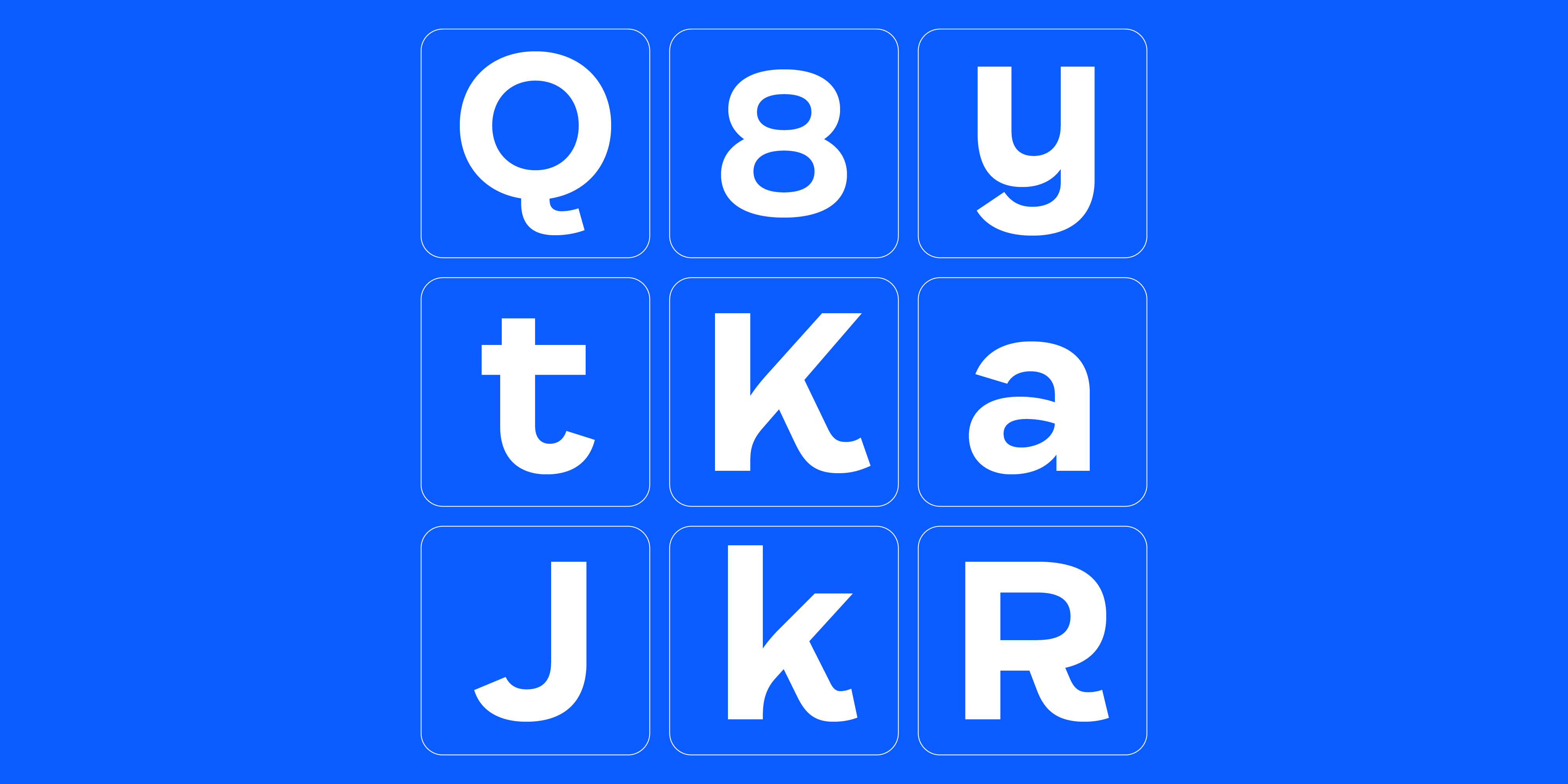
We worked on alternate characters, modified terminals and softened some traits to reach the typographical idea with which Zoom feels identified. The idea was to merge glyphs from the two versions of International, the standard and the alternative. Zoom asked us to design a new “k”; we also modified the terminal openings of the letters “a”, “e”, “s”, “J” and “S”. Another significant particularity is that we made rectangular the terminals that in the International are slightly triangular, such as the spur of the “n”.
Happy Display is cheerful, fun, and conveys the happiness of being able to communicate instantly and in the best conditions with any place on our beautiful planet.
Happy Display is exactly that—a cheerful, fun typography that conveys the happiness of being able to communicate instantly and in the best conditions with any place on our beautiful planet. Besides, it can generate visual impact and the exact atmosphere of relaxation, not forgetting the effectiveness and accuracy necessary so that a conversation is never cut off.
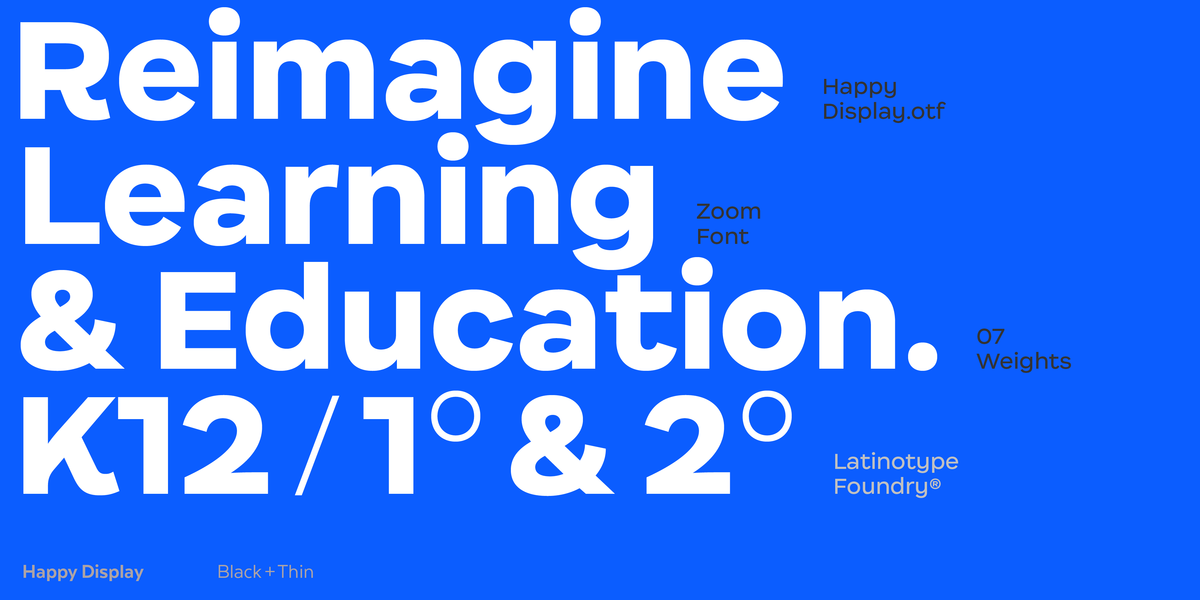
Happy Display has 416 glyphs and is made up of seven weights with their respective italics.
Text edited by Moliz