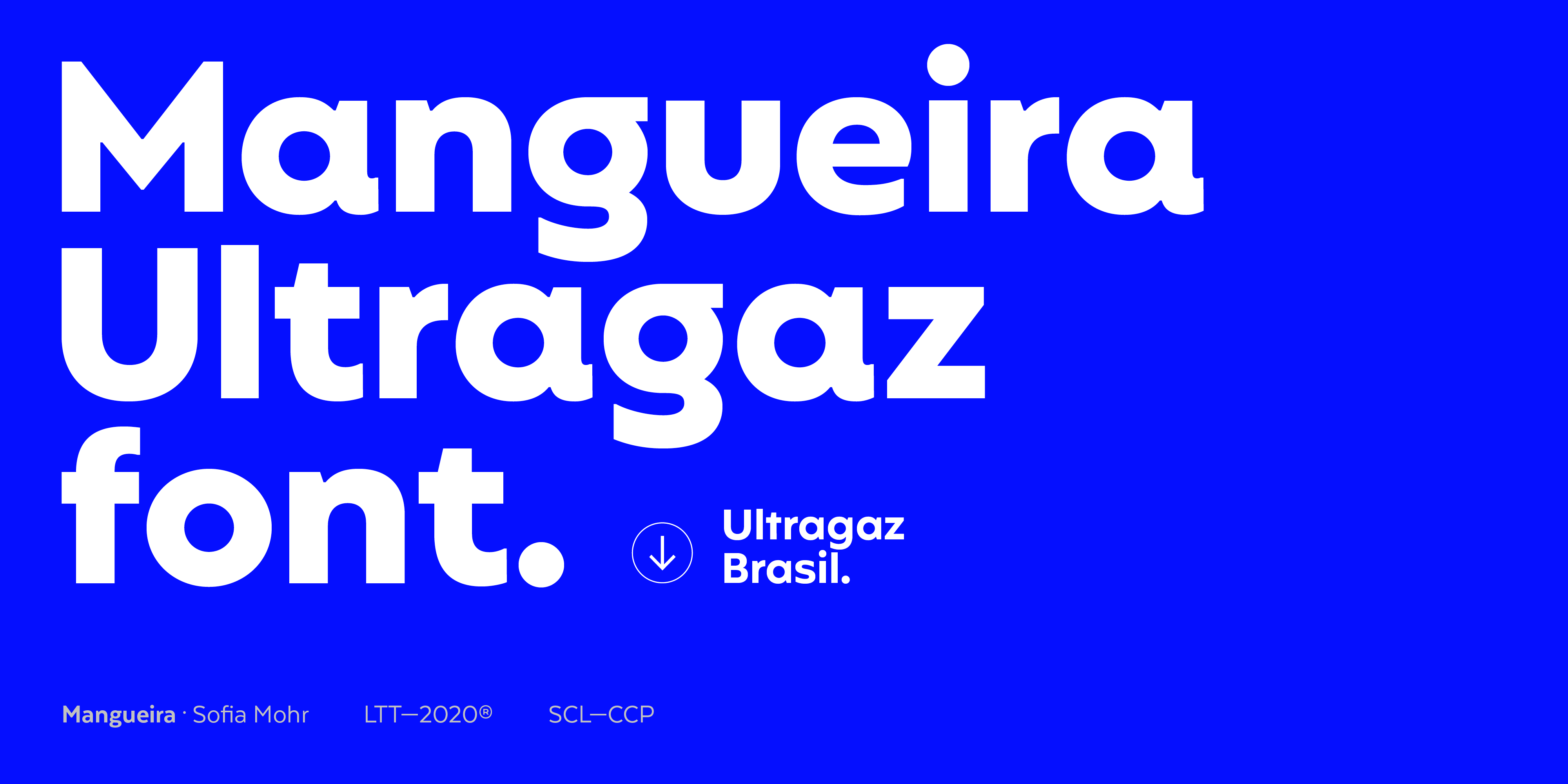
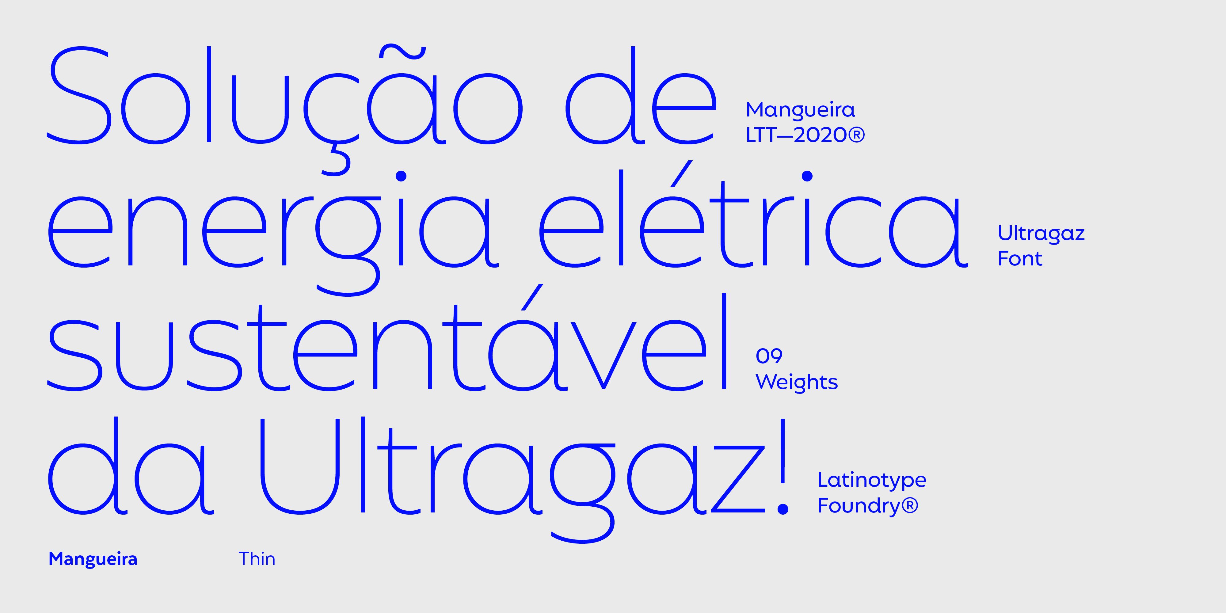
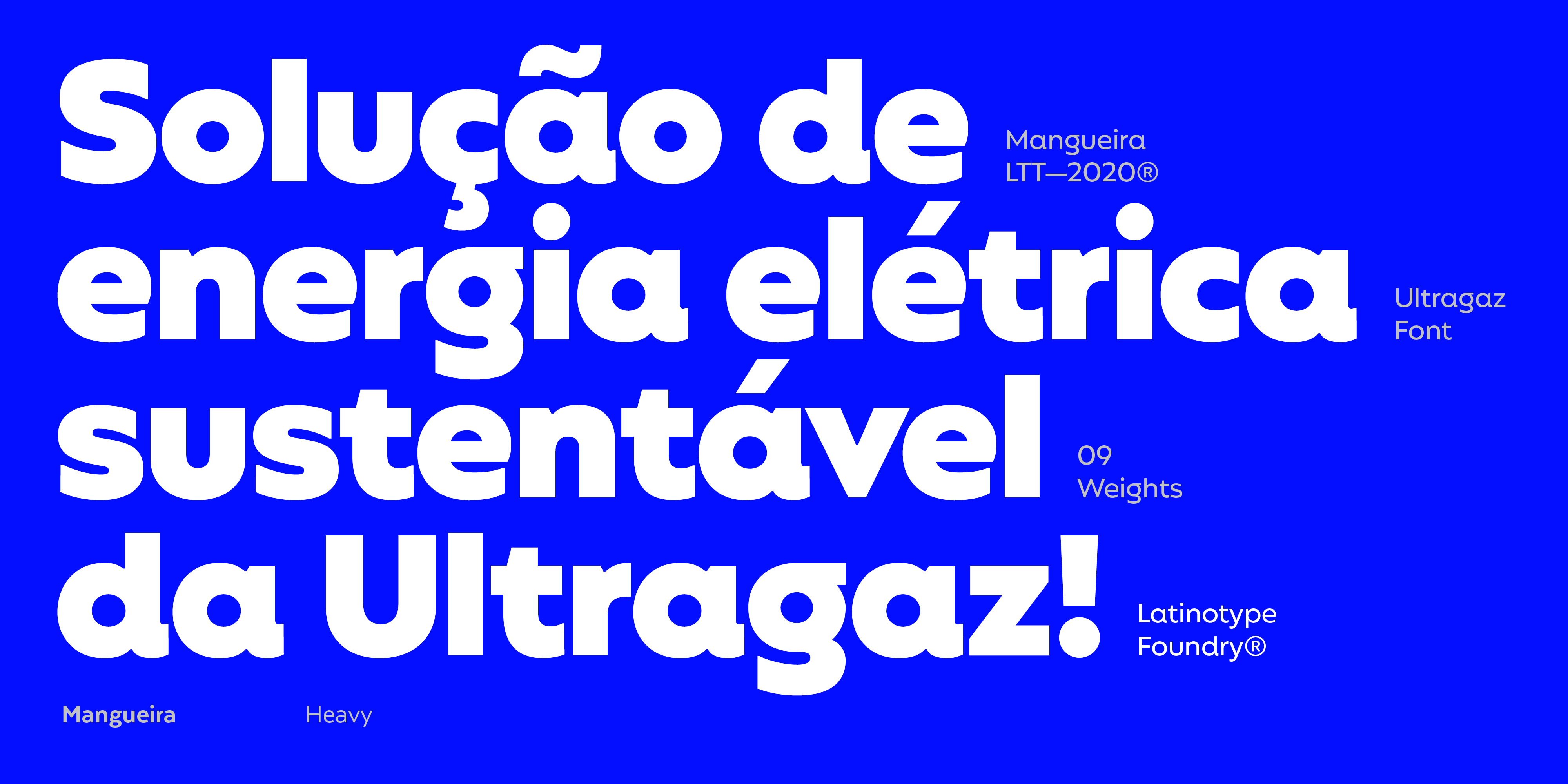
Mangueira and Ultragaz
Typography that serves as a vehicle to communicate the values of agreat brand.
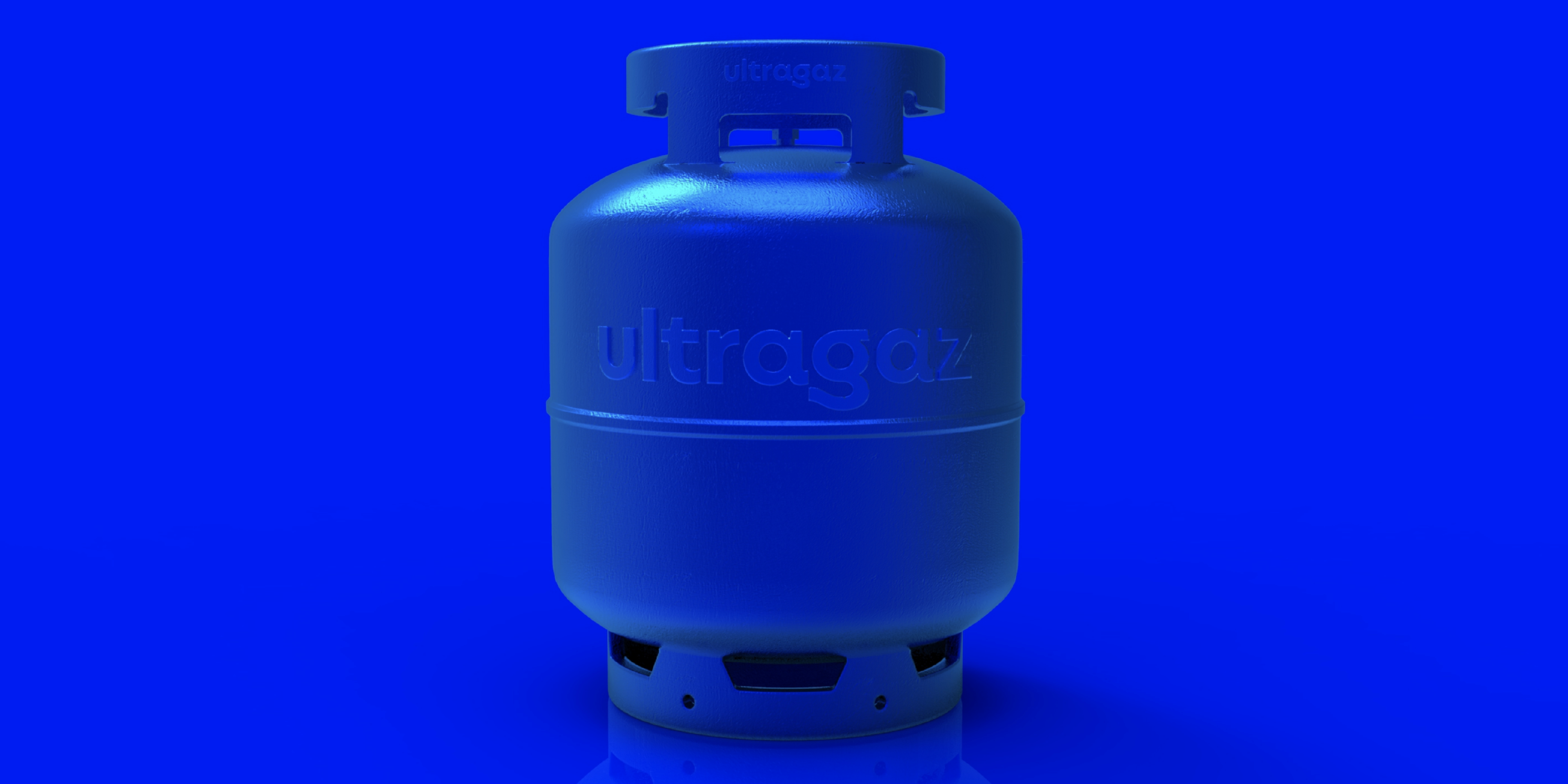
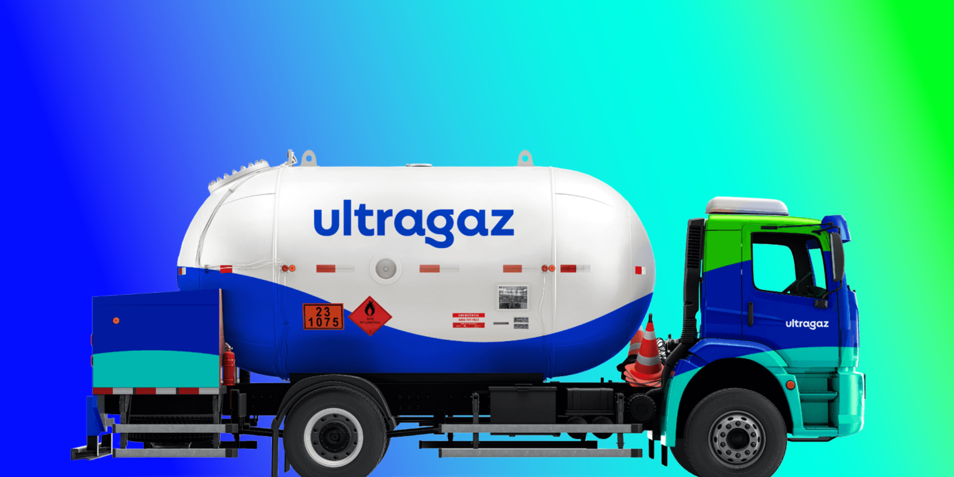
With eighty years of history, Ultragaz has been the most popular domestic gas distribution company in Brazil for decades, with millions of customers across the country.
Any alteration in a company of this nature, present in the daily lives of so many people, is a sensitive matter. However, at Ultragaz they were aware that it was necessary to adapt to the new demands of the market. Thus, they implemented deep changes affecting the three pillars of the company: business, communication, and, of course, the brand.
To do this, they contacted the branding and communication agency Anacouto. They chose the typeface Mangueira designed by Sofía Mohr and published by Latinotype not only for their visual identity —the logo—, but also for the entire corporate communication of the brand.
Mangueira is a lively and luminous geometric typeface, with high legibility. Its subtle combination of straight and curved elements gives it a uniquely humanistic personality—modern yet with a touch of classical nostalgia, making it timeless.
The classic and contemporary personality, calm yet bold personality of Mangueira, made it the ideal choice for such a profound makeover undertaken by Ultragaz. Continuing with this idea, choosing lowercase for the logo conveys the closeness and trust necessary to communicate the purpose of a large home energy distribution company. A choice that stands out is the elongation of the tail of the “g” as a symbol of the energy the company provides to millions of Brazilian households.
Whatever the size of the company, having a solid, well-constructed brand aligned with its business aspirations is crucial for its viability and business performance. This is the basic pillar of the trust of its users. In the world of branding, typography plays a leading role, as in the case of Ultragaz and Mangueira. This typeface is capable of faithfully transmitting the values and aspirations of the brand— modernity, reliability, proximity, and humanity.
In this sense, getting a license for corporate use of one of the typefaces of Latinotype is undoubtedly the ideal solution to provide a brand of typography that adapts to its communicative needs and serves as the lever that makes it stand out from the competition. There is no doubt that as of today, typography in particular, and graphic design in general represent a high-value strategic investment.