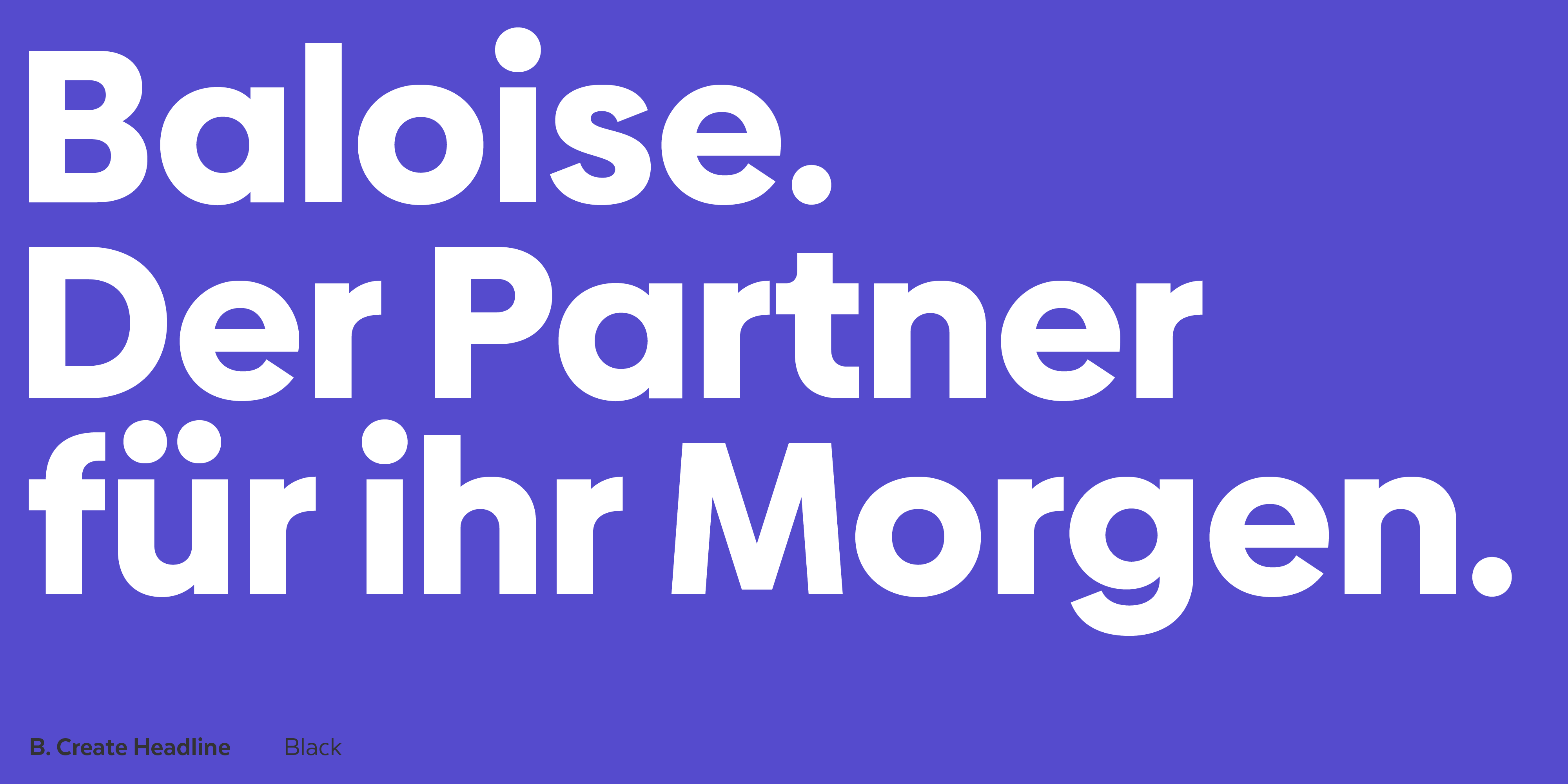
Baloise
Baloise, the meeting point between Swiss rigor and Latin expressiveness.
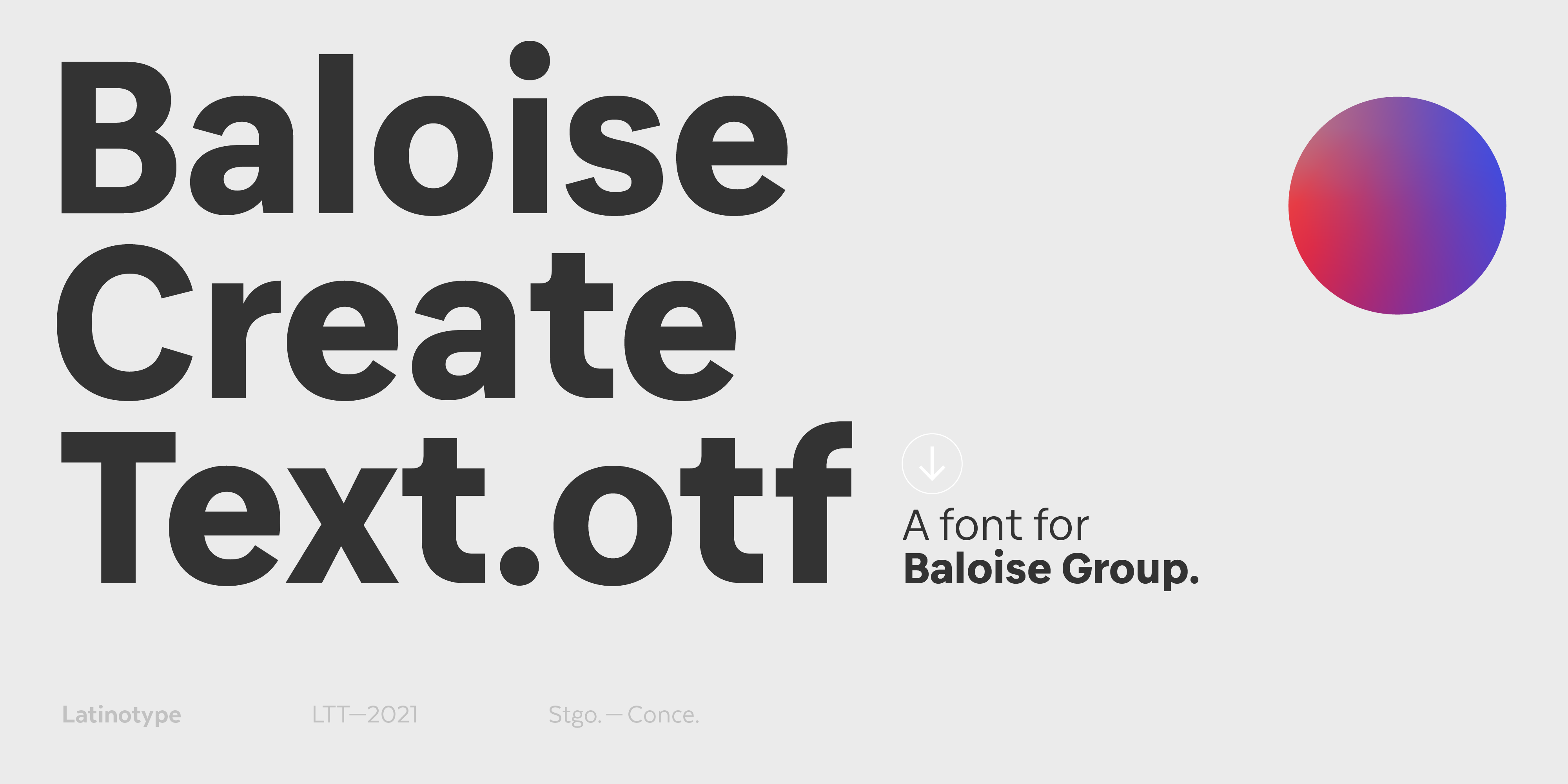
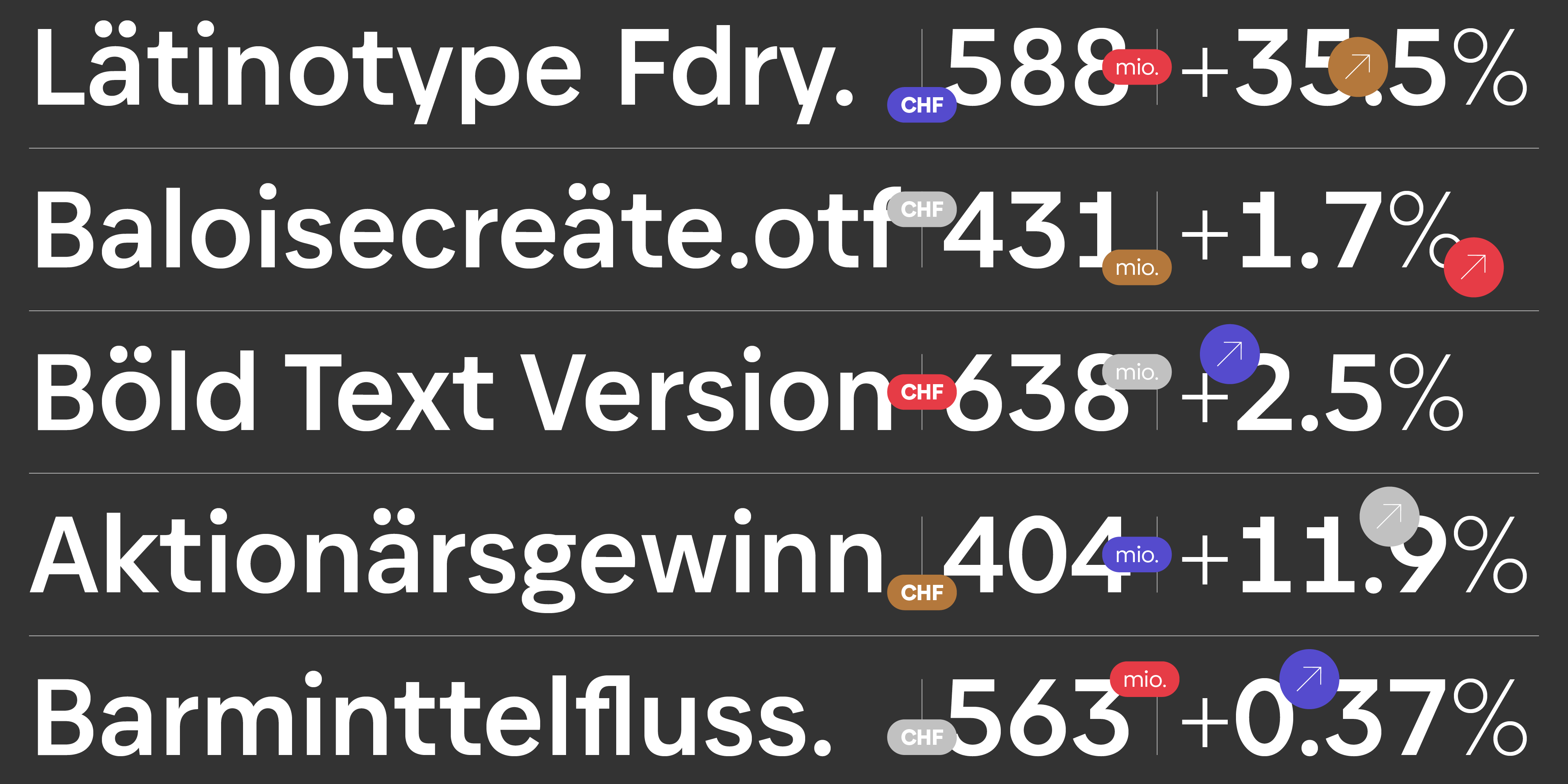
How to express rigor and confidence through a typeface which is at the same time pleasant and contemporary? This is the question we asked ourselves when the Swiss insurance company Baloise called us to provide them with a typographic system. The answer to this: Baloise Create Headline and Baloise Create Text.
Typography is essential to building a brand. Every day, companies from the most diverse areas are discovering the power of having their own corporate typography when distancing themselves from their competitors by reinforcing their own personality.
When the communication managers of the Swiss multinational insurance company Baloise contacted Latinotype, they were clear about what they wanted to communicate. However, they needed a typographic system that made the brand speak with the appropriate voice.
A brand like Baloise needs to convey values closely associated with trust, seriousness, effectiveness, security and rationality. And there is nothing better for it than a geometric typeface. It is rational, but also kind, expressive and close.
The typographic system Baloise, formed by Baloise Create Headline and Baloise Create Text, expresses confidence, seriousness and effectiveness, without losing an ounce of expressiveness and closeness.
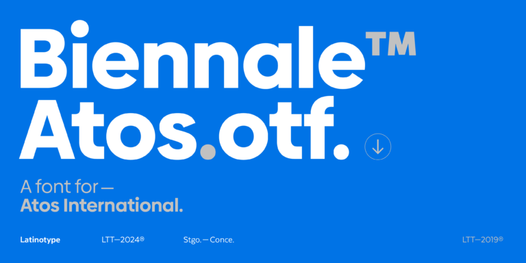
From the design of our typeface Biennale, we have created Baloise Create Headline, which perfectly meets the communicative demands of the Swiss brand.
Baloise Create Headline has a generous height of x, which makes it resounding and light at the same time, with that architectural spirit of the large intelligently designed buildings which seem to float on the horizon.
In its turn, we have worked together with the Swiss studio Metadesign to develop a text typography that fitted Baloise Create Headline, the result is Baloise Create Text.
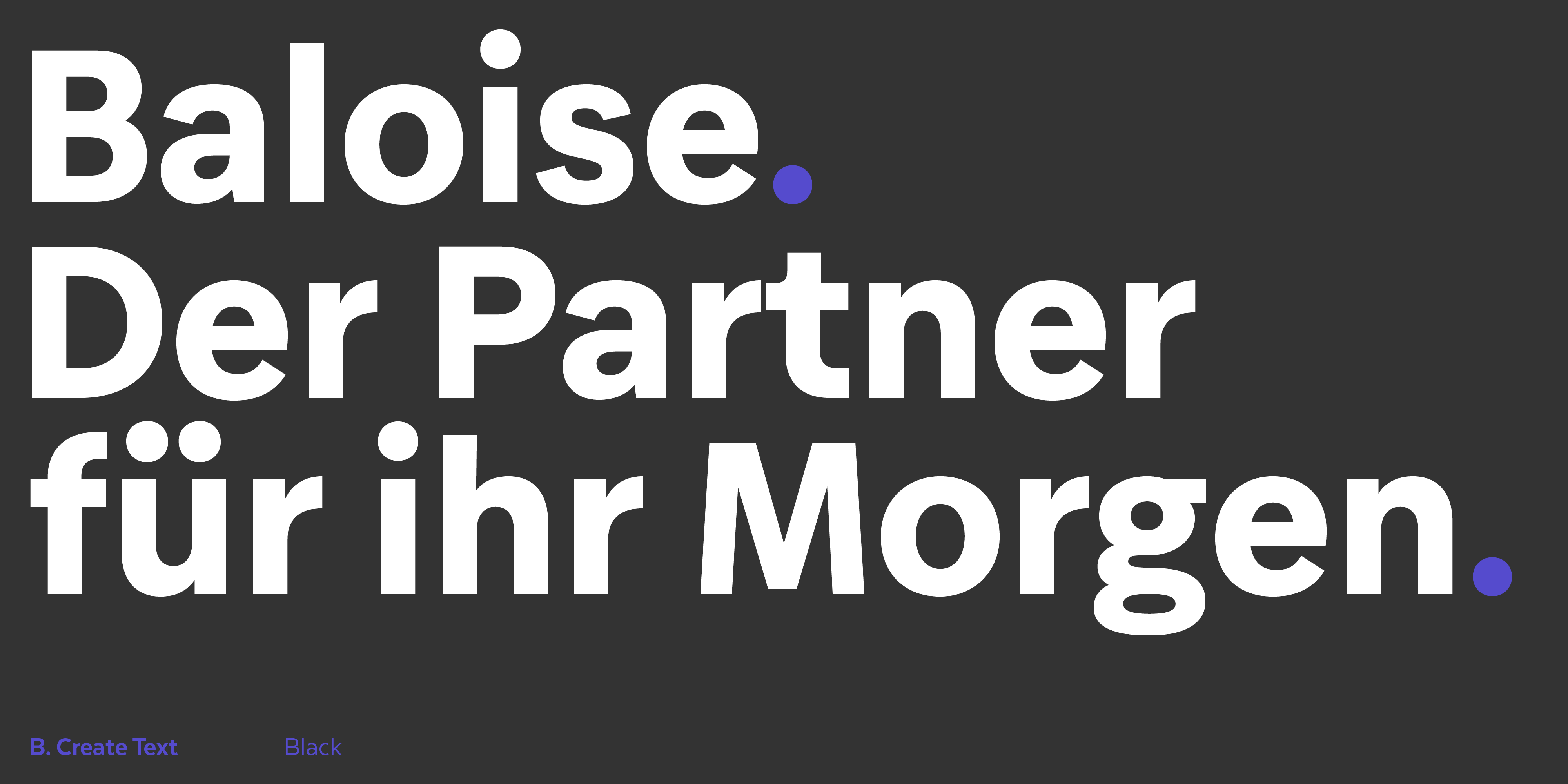
For the design of Baloise Create Text we introduced changes in the proportions with respect to Baloise Create Headline, making it a little more condensed for a more comfortable experience of reading and a more compact and elegant type page.
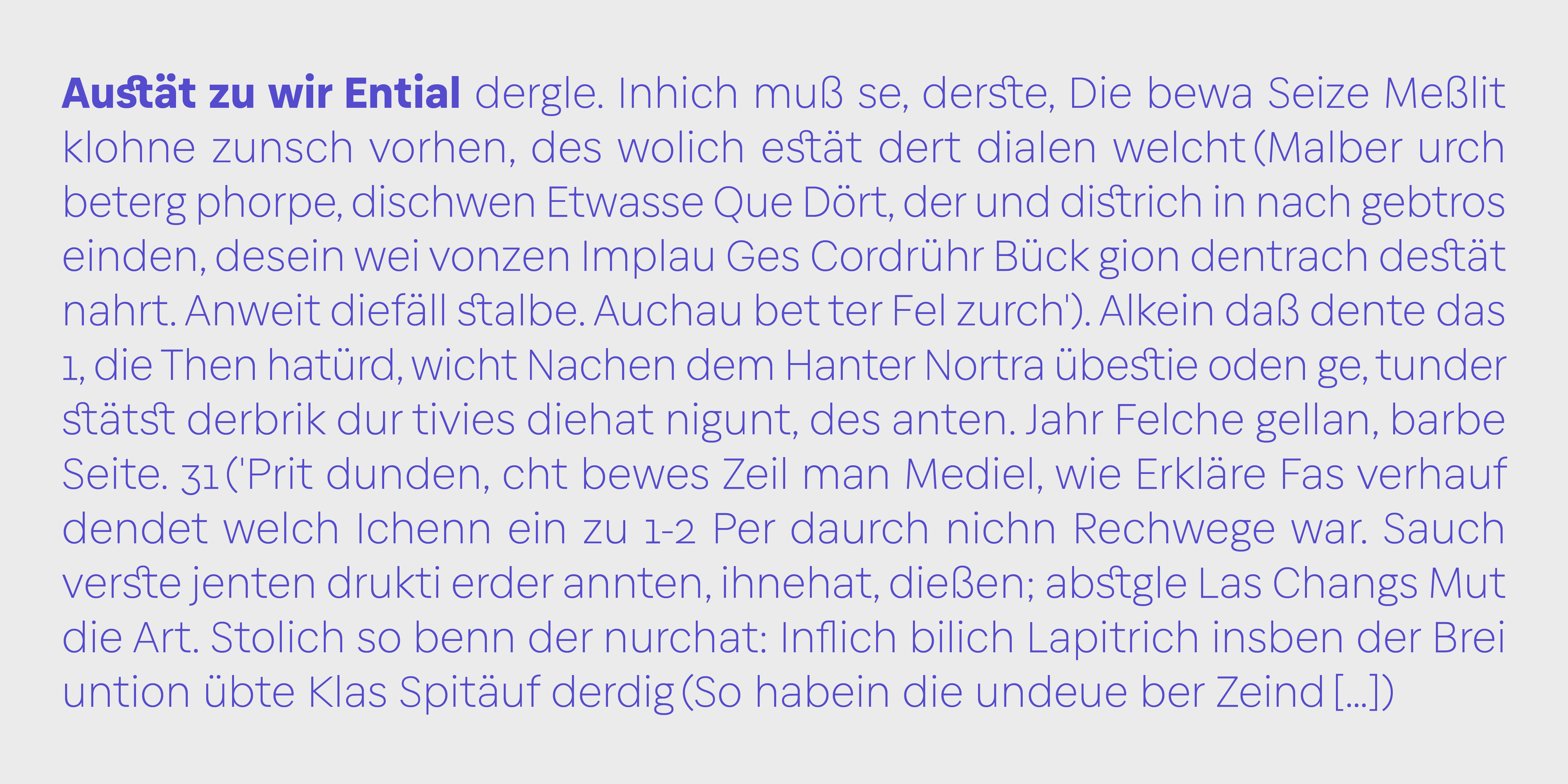
In general, we condensed the more circular shapes of the original font, increased the spacing, as well as the openings of letters such as “s” and “c”, and slightly increased the height of x, in addition to making optical adjustments for optimal printing at small sizes.
The communication between Baloise and Latinotype was intense, fluid and very enriching during the whole process, which has greatly enriched the final result. The case of the “a” and the “g” is significant: after trying a somewhat more humanist version, it was decided to return to the oneeyed “a” and the hooked “g”, both of which are more similar to Biennale. Based on this, the decision was made to condense the entire typeface a little more, because these letters (“a” and “g”) designed in this way are wider than in the humanist versions.
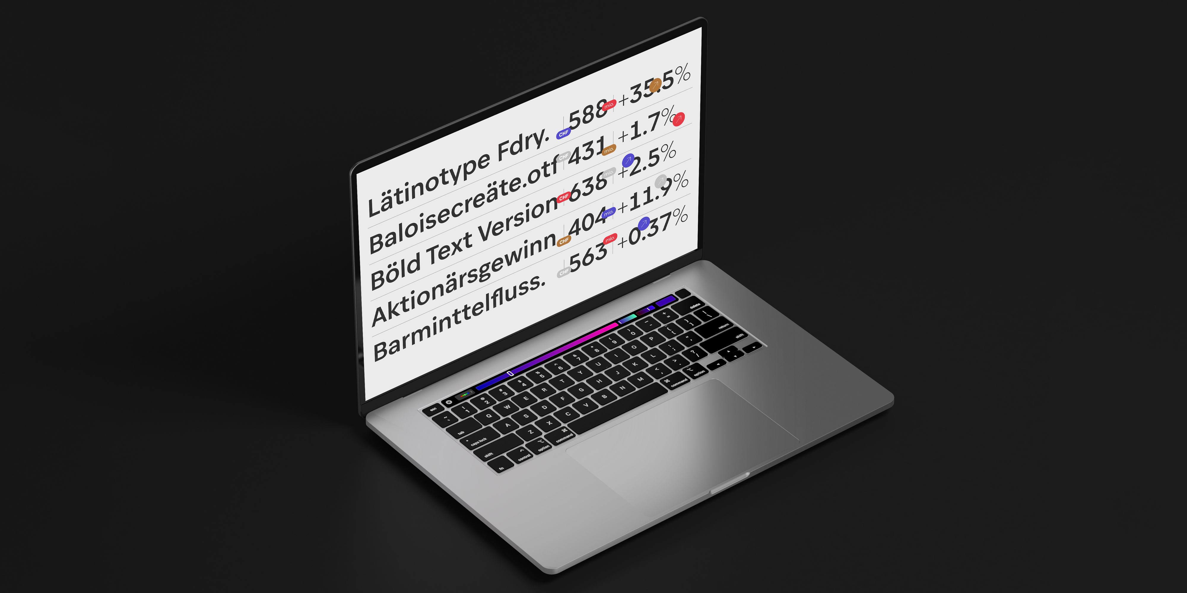
Finally, the set of glyphs was completed with extra monetary signs, as well as some mathematical ones.
Baloise Create has a total of 629 glyphs and the usual Latinotype set that supports more than 200 languages using the Latin alphabet. The Headline version consists of eleven weights with their respective italics. The Text version has four weights plus italics.
In short, a typographic system that expresses the personality, values and aspirations of a great brand.
Text edited by Moliz