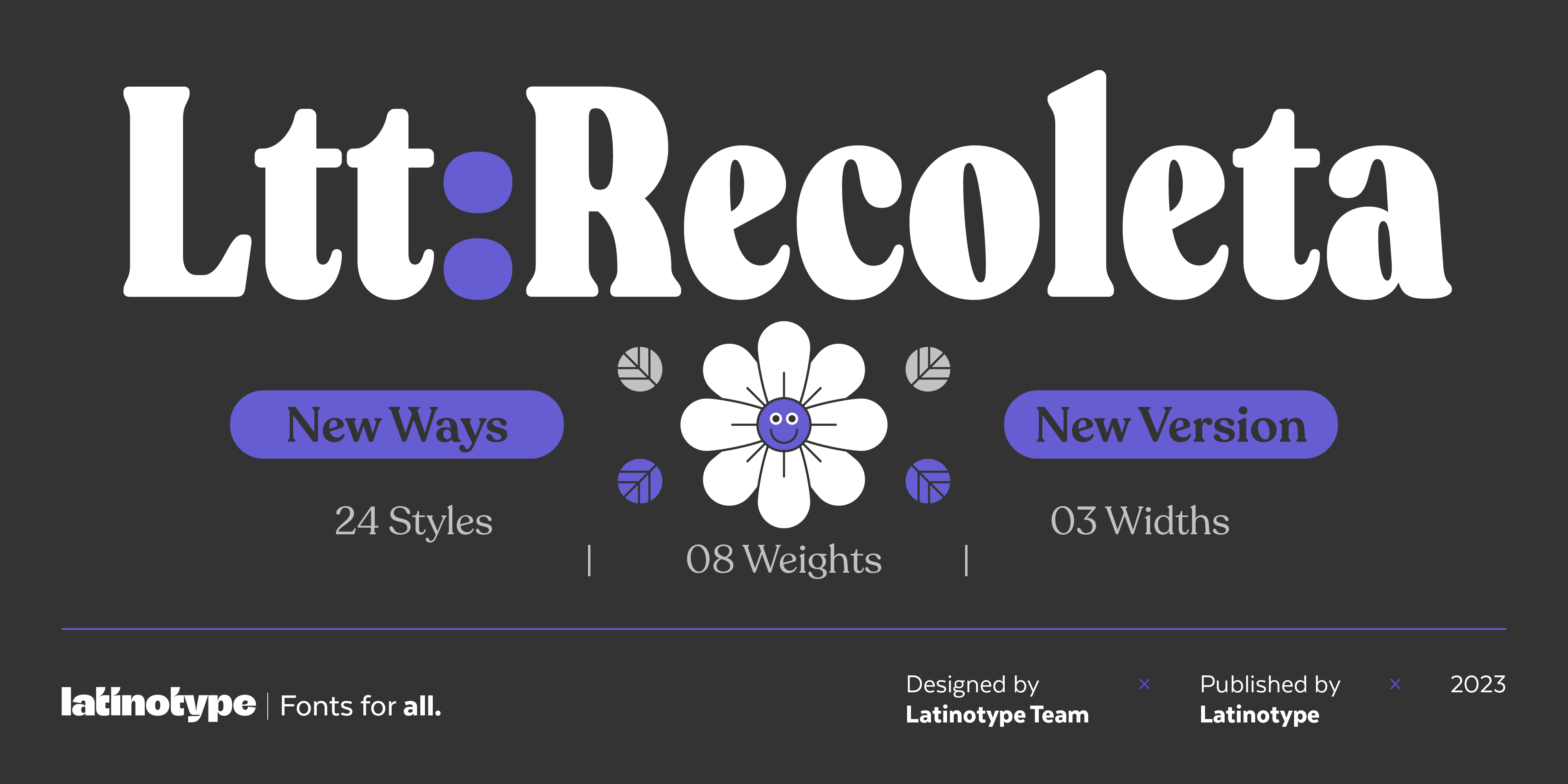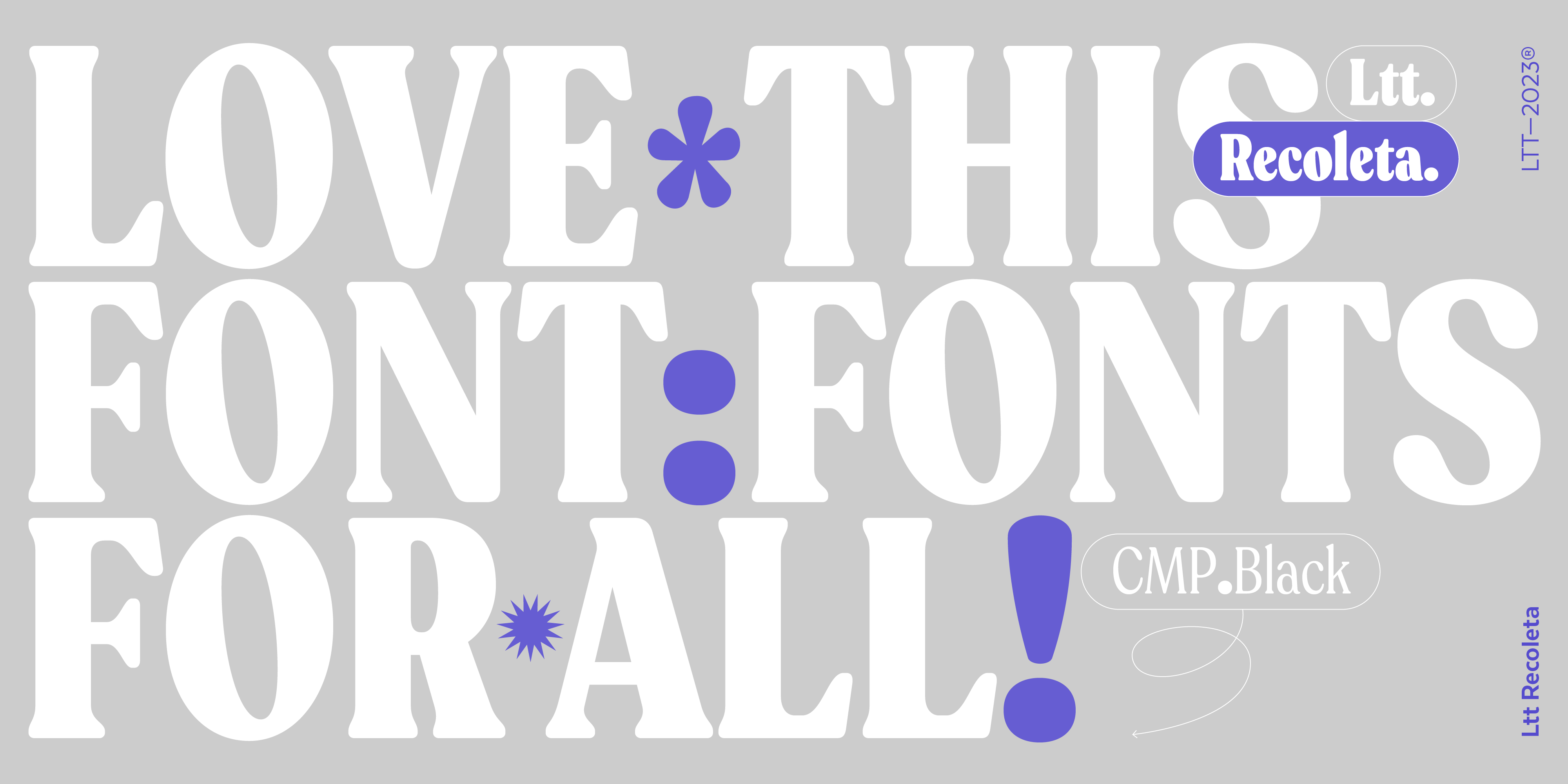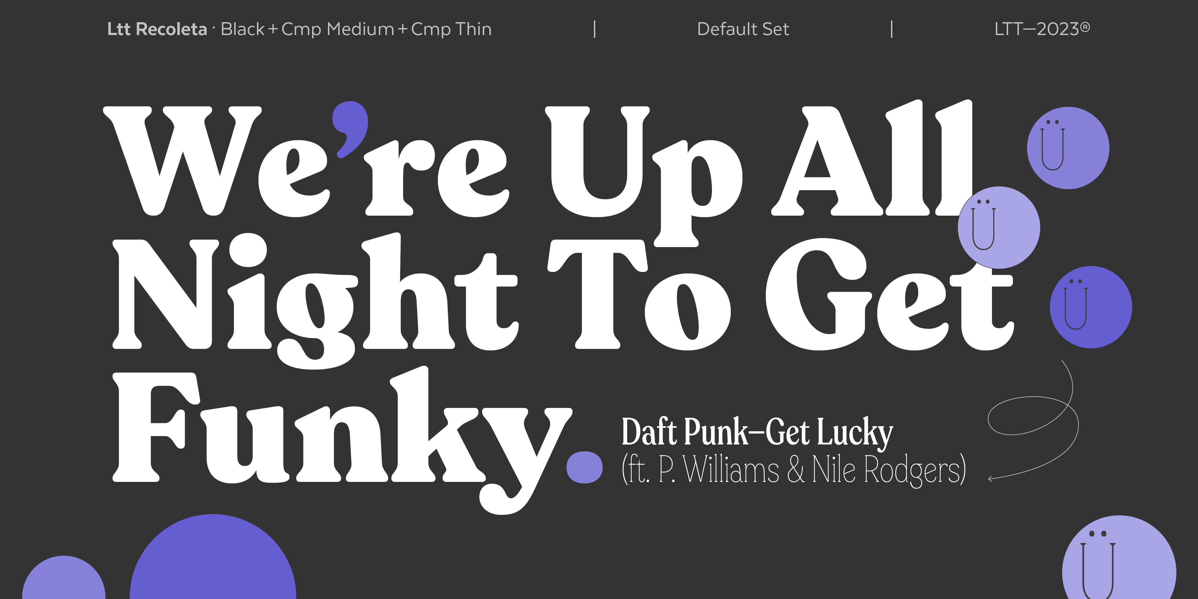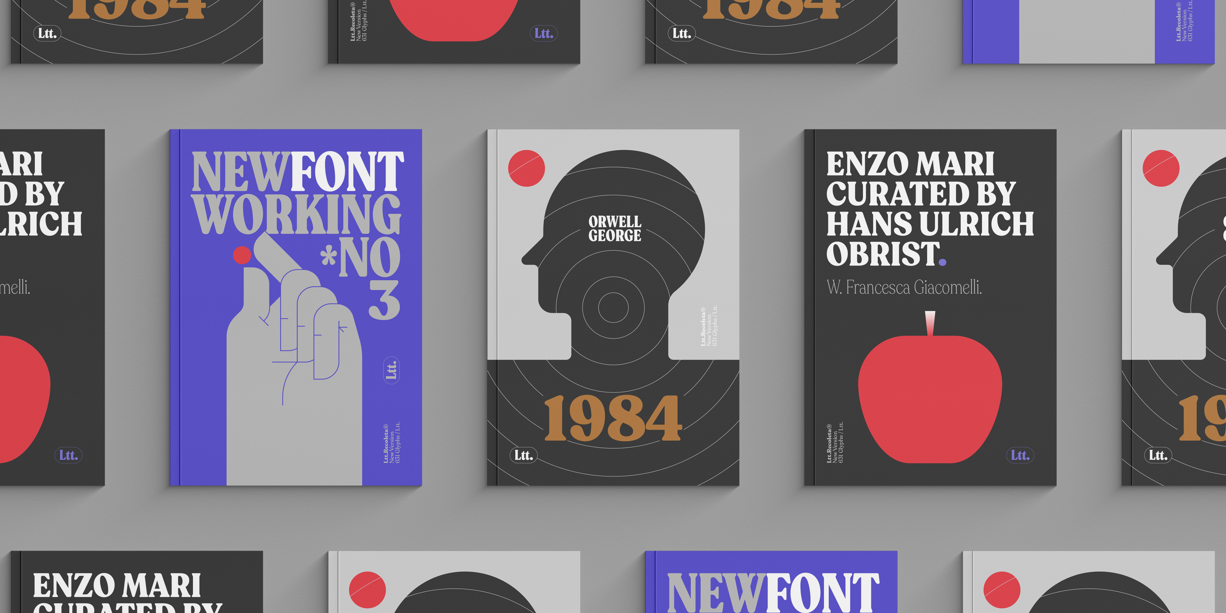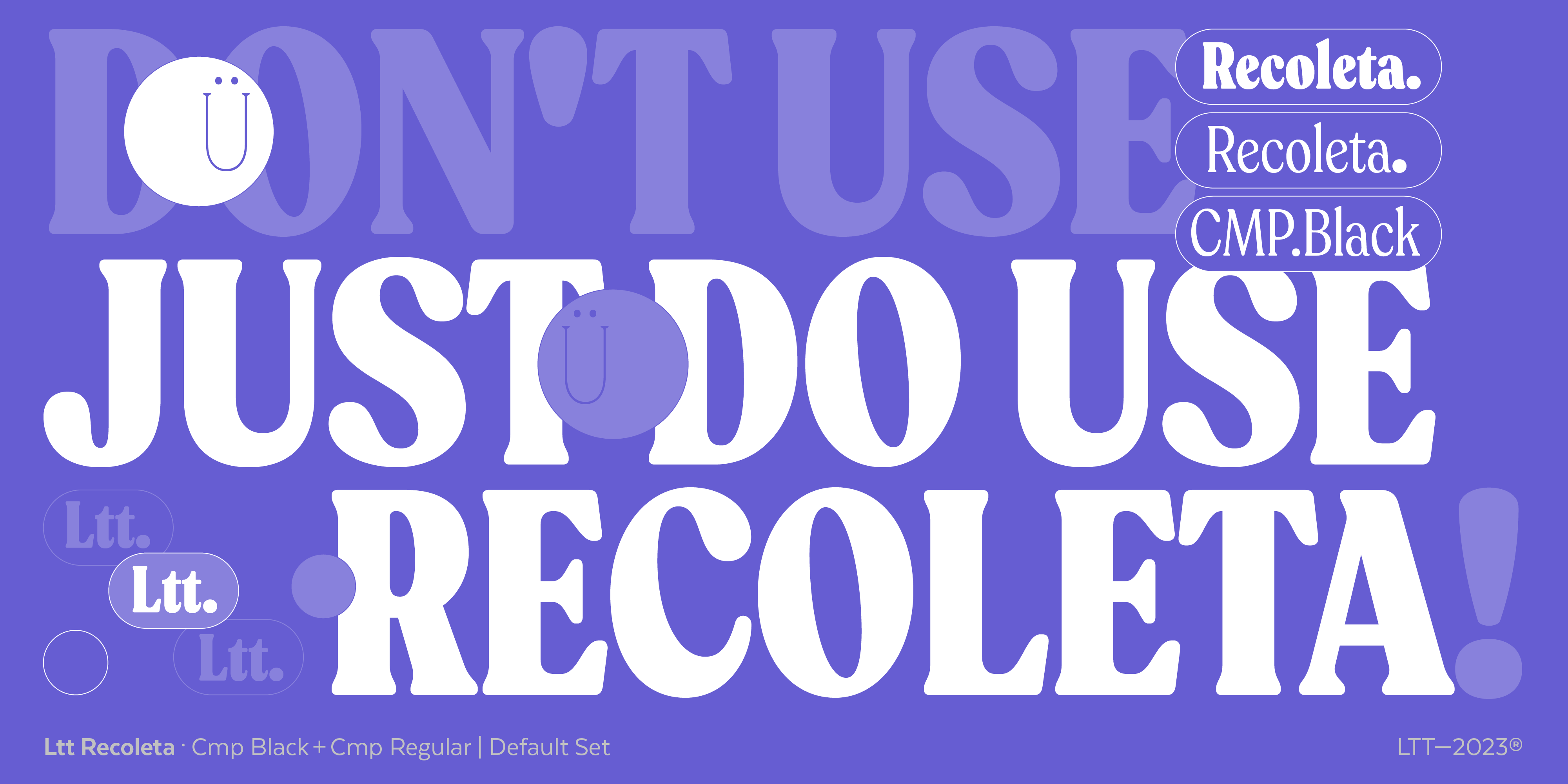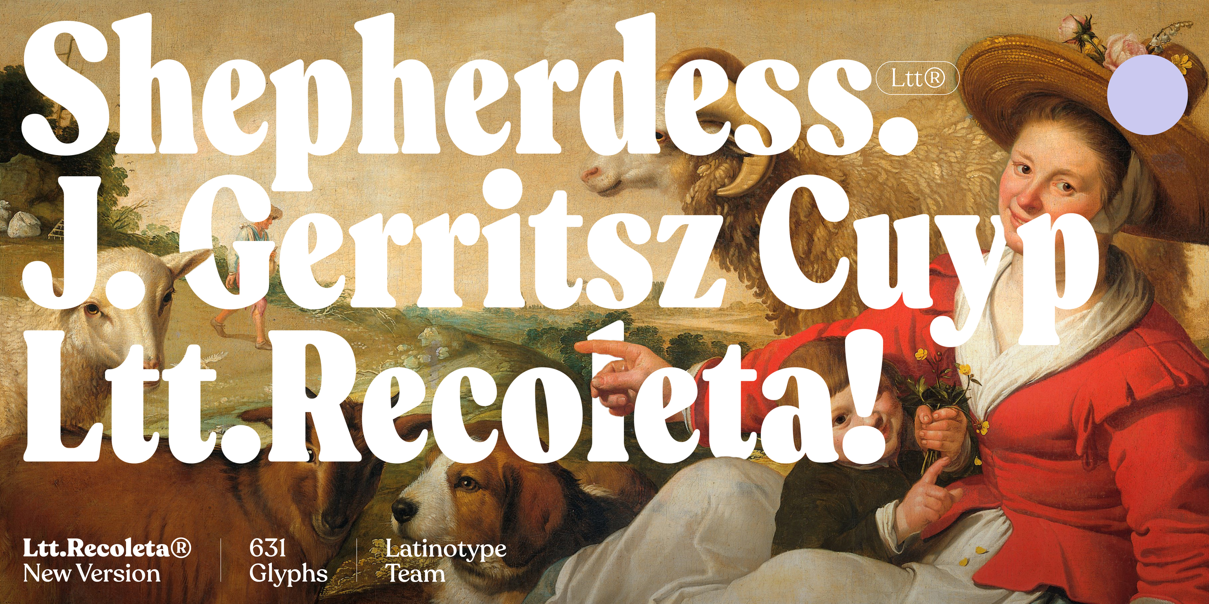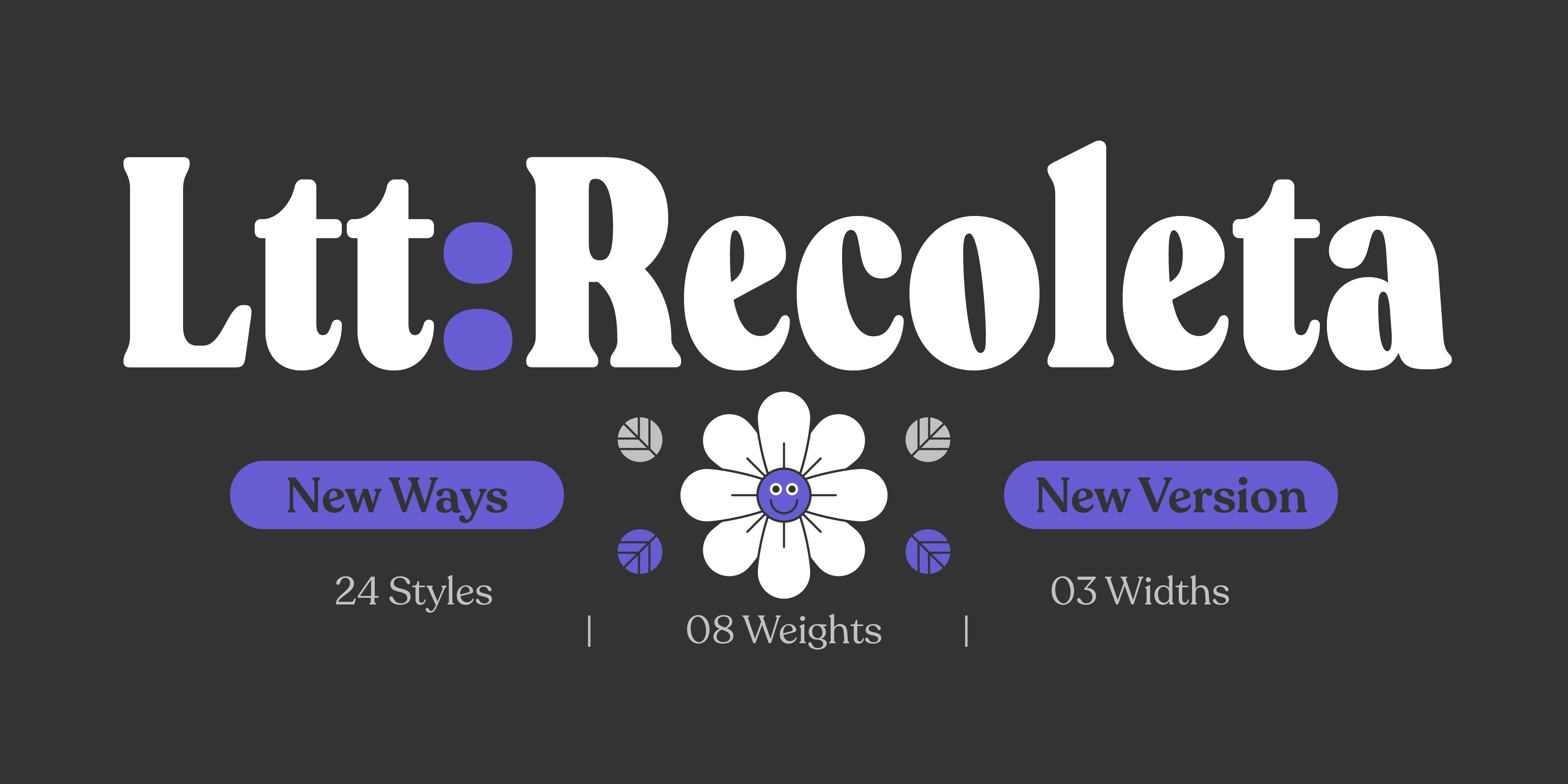
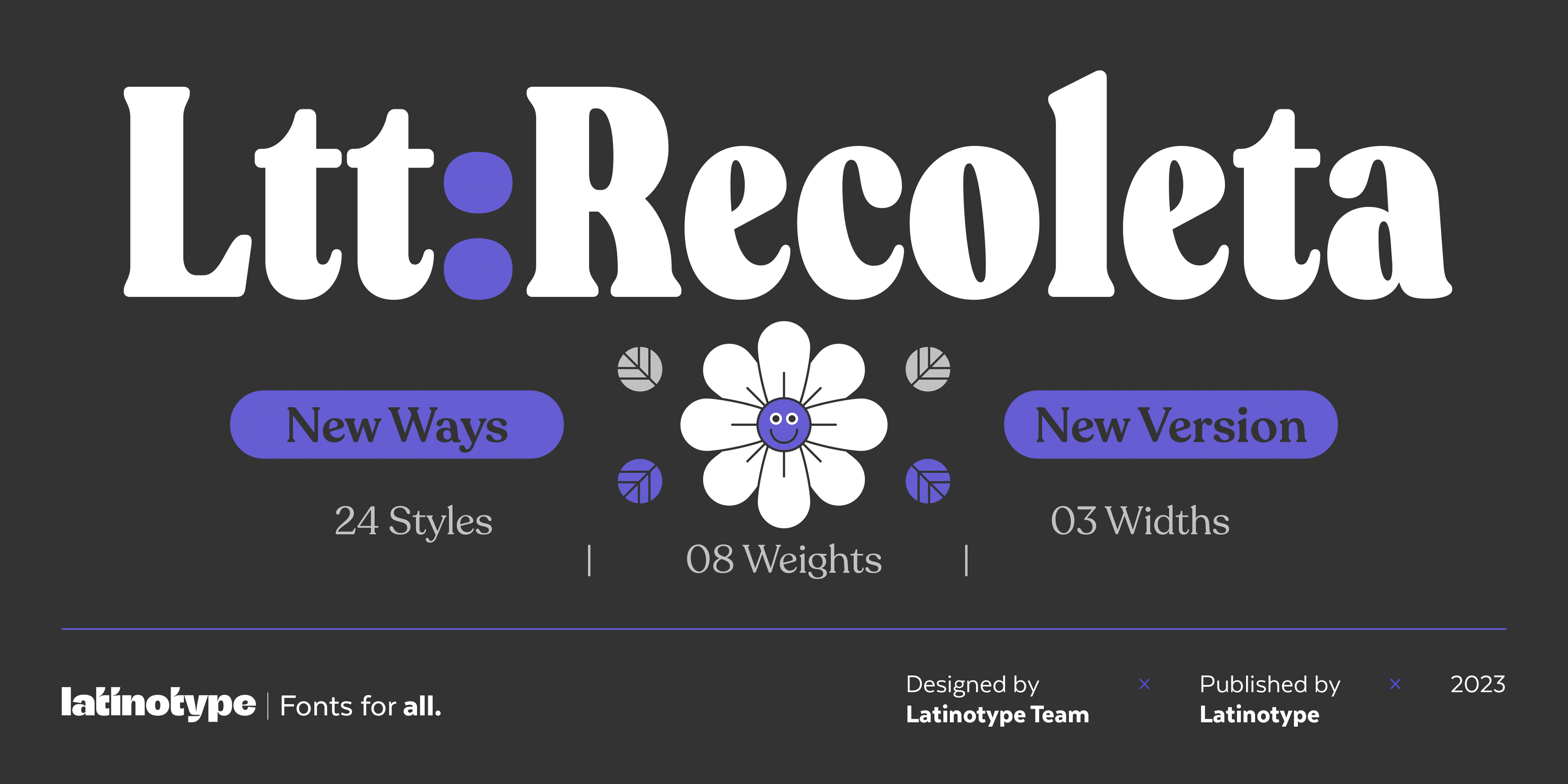
Ltt Recoleta
Abundance of typographic sensations
The secret of the success of Recoleta is the abundance of sensations it conveys. We could create an extensive list of adjectives seeking to capture its manifold essence. There is a Recoleta for each person, with a unique and special meaning, just like it happens with those great songs that have captivated multiple generations and remain as fresh and surprising as the first day.
Thus, beyond its formal characteristics, Recoleta is already a classic. And as a typography classic, it does not just appear overnight, but it’s being built day by day thanks to the use hundreds of designers make of it. A typography becomes a classic when it always seems fresh and surprising, and yet at the same time, it evokes a certain sense of familiarity and closeness of what we immediately recognize, like an old friend who is always there for us.
This new Recoleta that now sees the light, expanded and improved by the Latinotype team, is a typography perfectly built for its use in the 21st century. It takes us back to the coolest typographic modes from the 70s and 80s, a style that has transcended borders and trends.
The sinuous funky light of the most extended and resounding styles is in perfect harmony with the delicate and stylish shapes of the thin styles, thus creating a complex and versatile typographic system that is enriched by all the innovations introduced by Recoleta New Version.
Recoleta draws directly from classical sources like Windsor and Cooper, both designed early in the 20th century. However, their period of splendor did not begin until the 1970s and has not yet ended. However, in order to achieve optimal performance in the digital field, it became necessary a complete adaptation to new media and new times with their particular tastes and sensitivities.
Originally designed in 2018 by Jorge Cisterna, Recoleta became very soon one of the iconic fonts of Latinotype, remaining among the best-selling fonts on My Fonts during all these years.
But we had to go beyond: there was still room for improvement of Recoleta. For this reason, the Latinotype design team made the decision to go deeper into its design to achieve an even more versatile and functional font.
The typographic design is a process that involves constant adaptation to the different contexts that may arise. Historically, innovations in the typography and publishing world happened extremely slowly. Maybe because of this, classic typefaces are perceived as rigid artifacts, since they have maintained immutable for centuries. Different typographic styles appeared decades or even centuries apart. From the mid-19th century, technical progress helped to gradually speed up the traditionally calm world of typography. But it has been the digital explosion that boosted it and nowadays, the innovations happen at great speed, sometimes leaving us with little time to assimilate them, and the digital typography fonts have to adapt to the technical and aesthetical requirements of these hectic times.
Recoleta New Version, thanks to its range of innovations and improvements with respect to its first designs, comes to show that it is a typographic system far above fashions and trends.

Dissecting Recoleta New Version
The typographic design team of Latinotype has gone straight to the root of Recoleta — its drawing — focusing on the sinuosity of the shapes and the harmony of the curves, while drawing a pronounced condensed version. This way, alongside the classic version and the new condensed version, we have designed a style halfway between the other two, a version of intermediate condensation in order to expand its possibilities of use.
The new condensed versions expand very significantly the composition options, focusing even more on the functionality of Recoleta, since in this way, in addition to achieving, in editorial terms, greater versatility in establishing hierarchies, we achieve an important saving of characters per line of text when necessary without sacrificing a single bit of visual impact, quite the opposite.
The most condensed version of the new Recoleta, thanks to taking up such little space, allows for a certain degree of exaggeration in the size of the characters, which has an impact on the use of the space in posters, covers, or credits with a more than powerful visual, elegant, resounding and sophisticated presence.
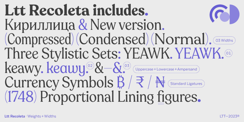
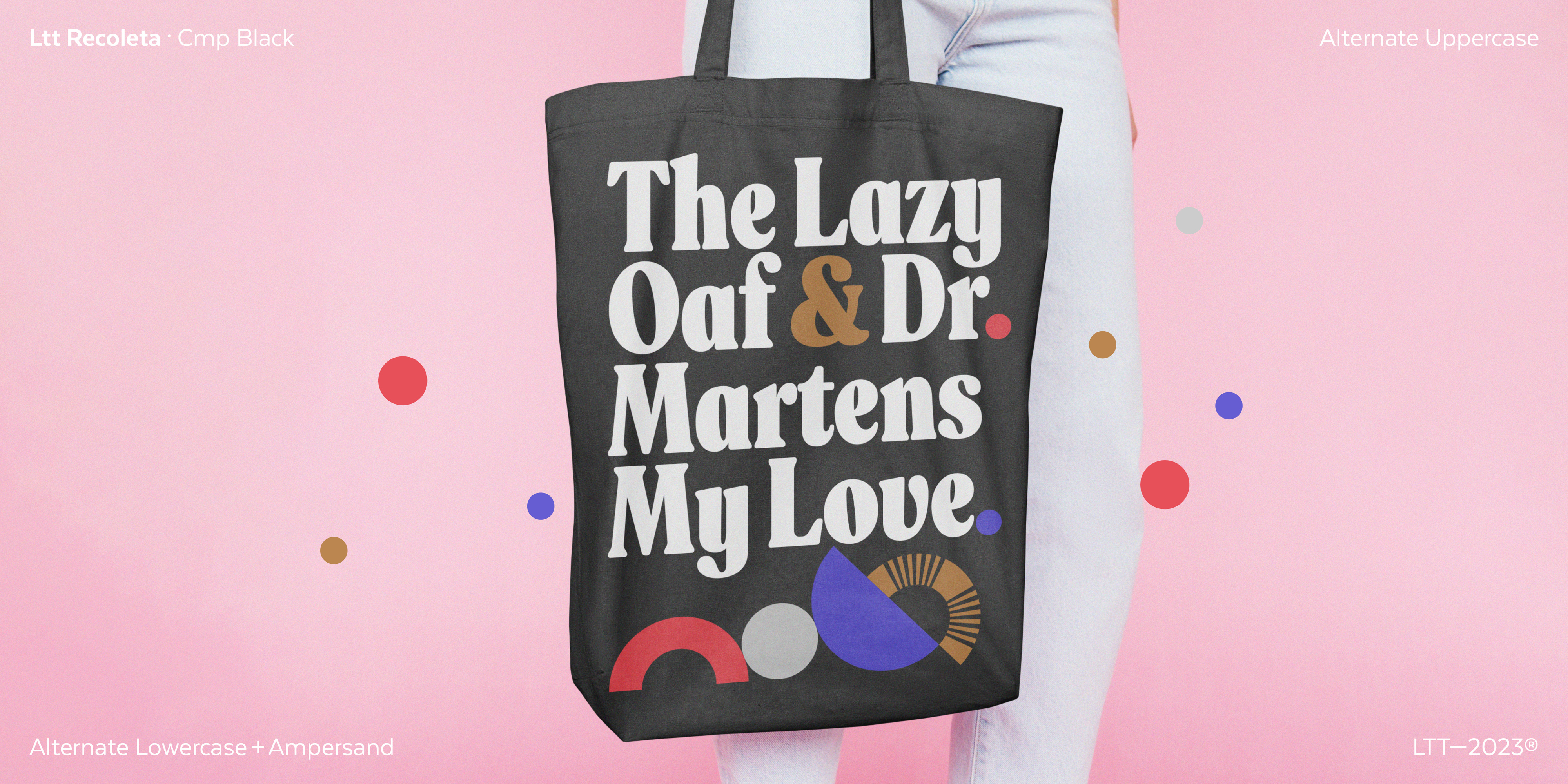
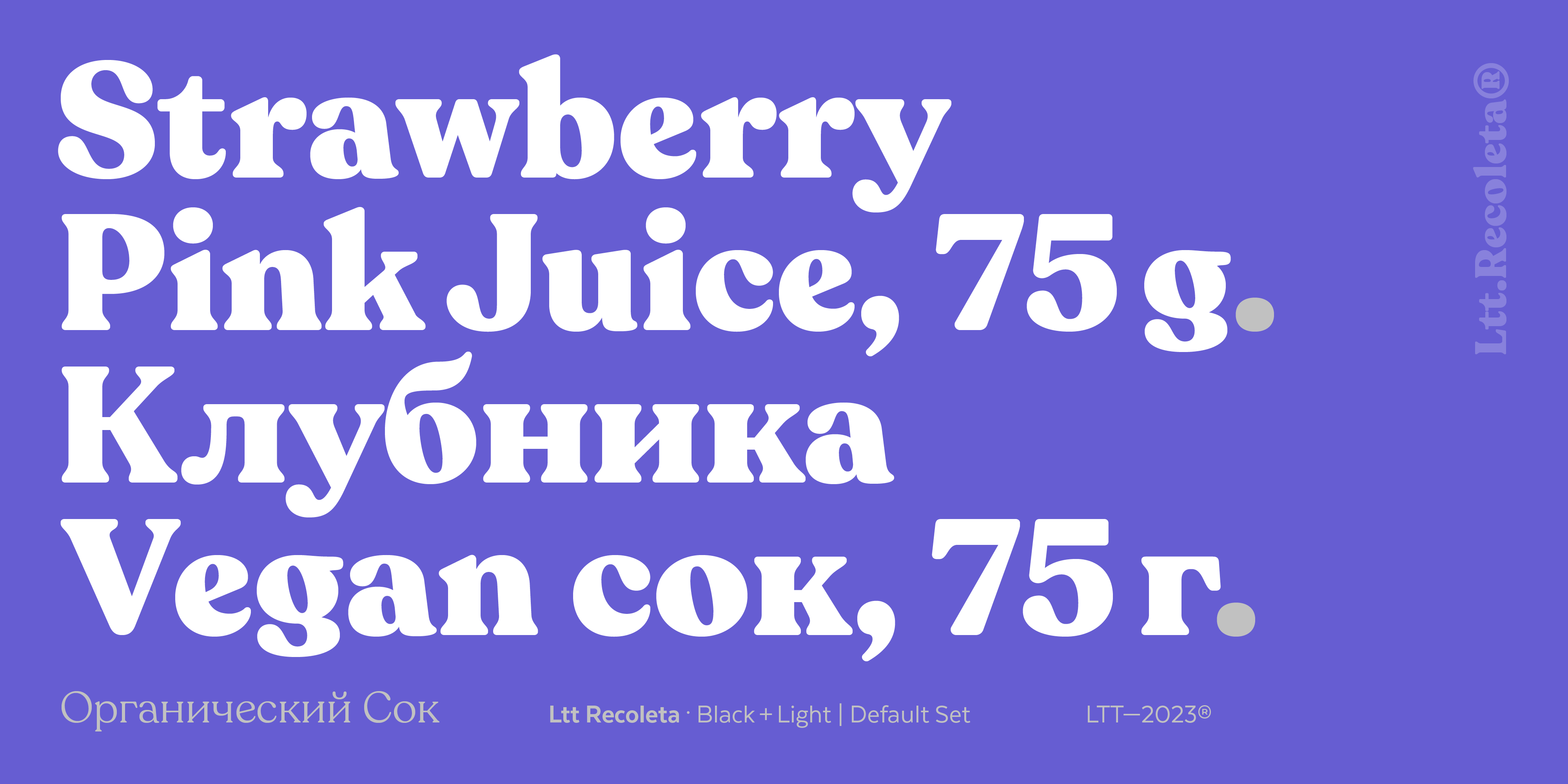
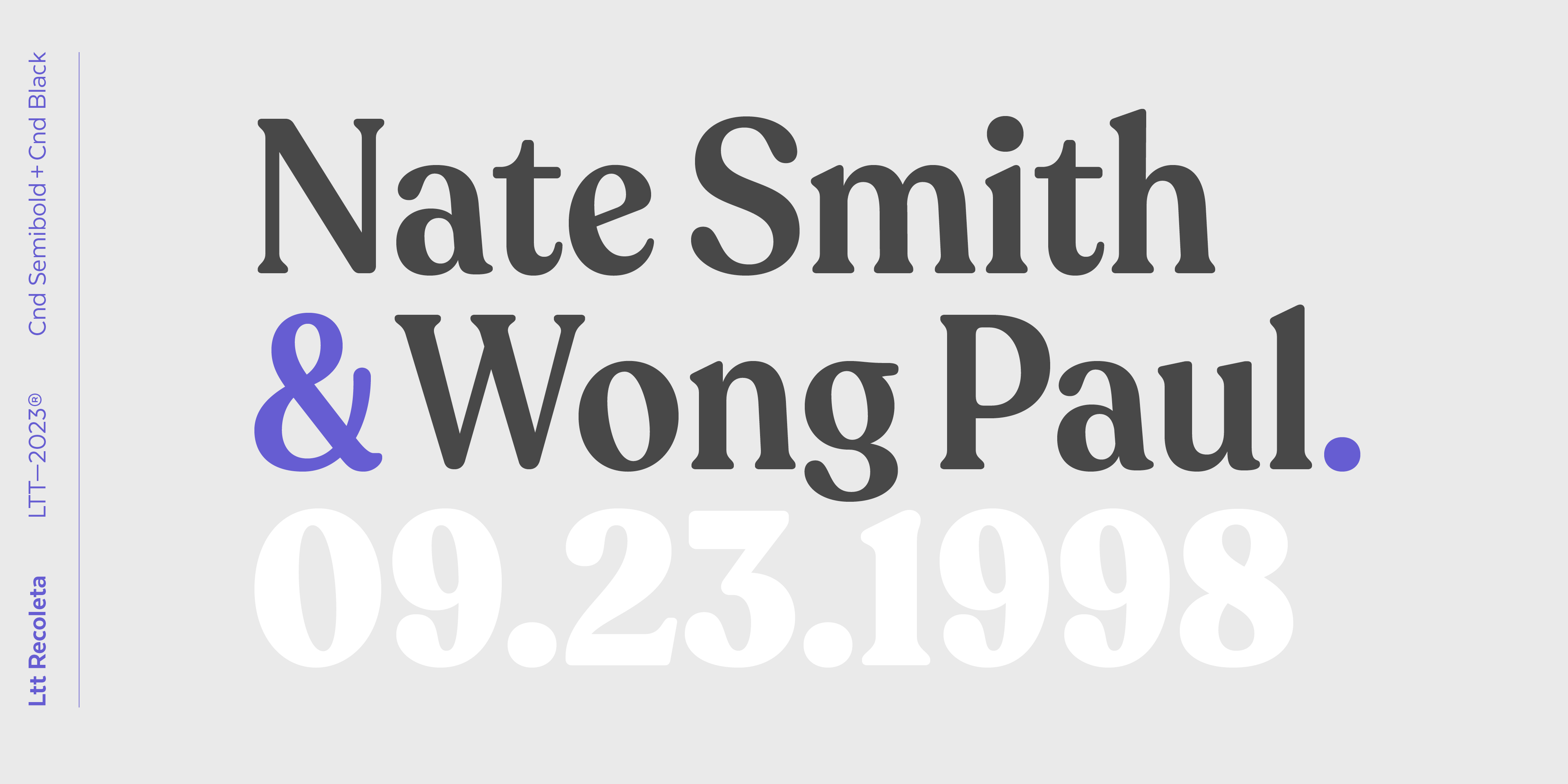
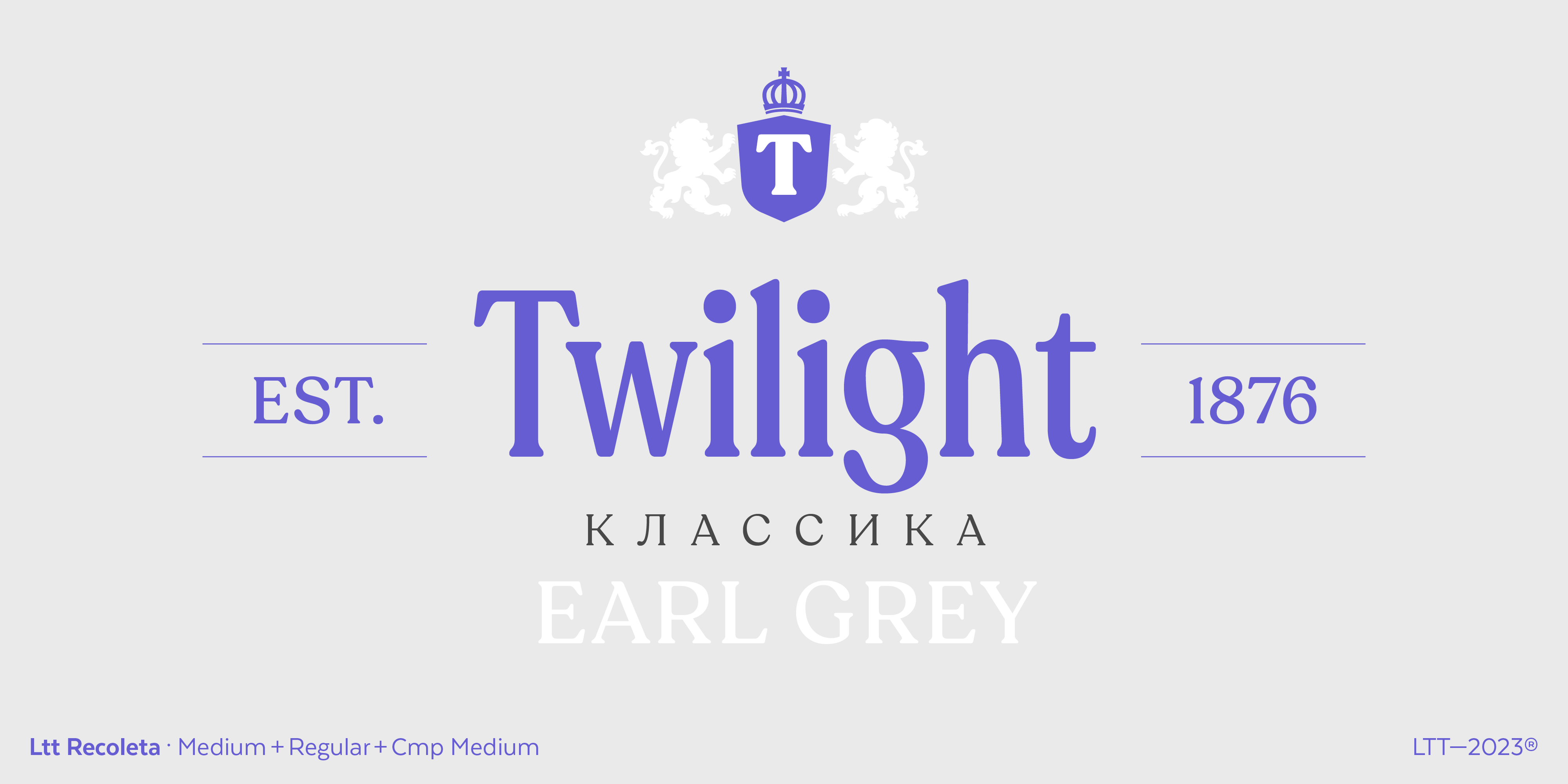
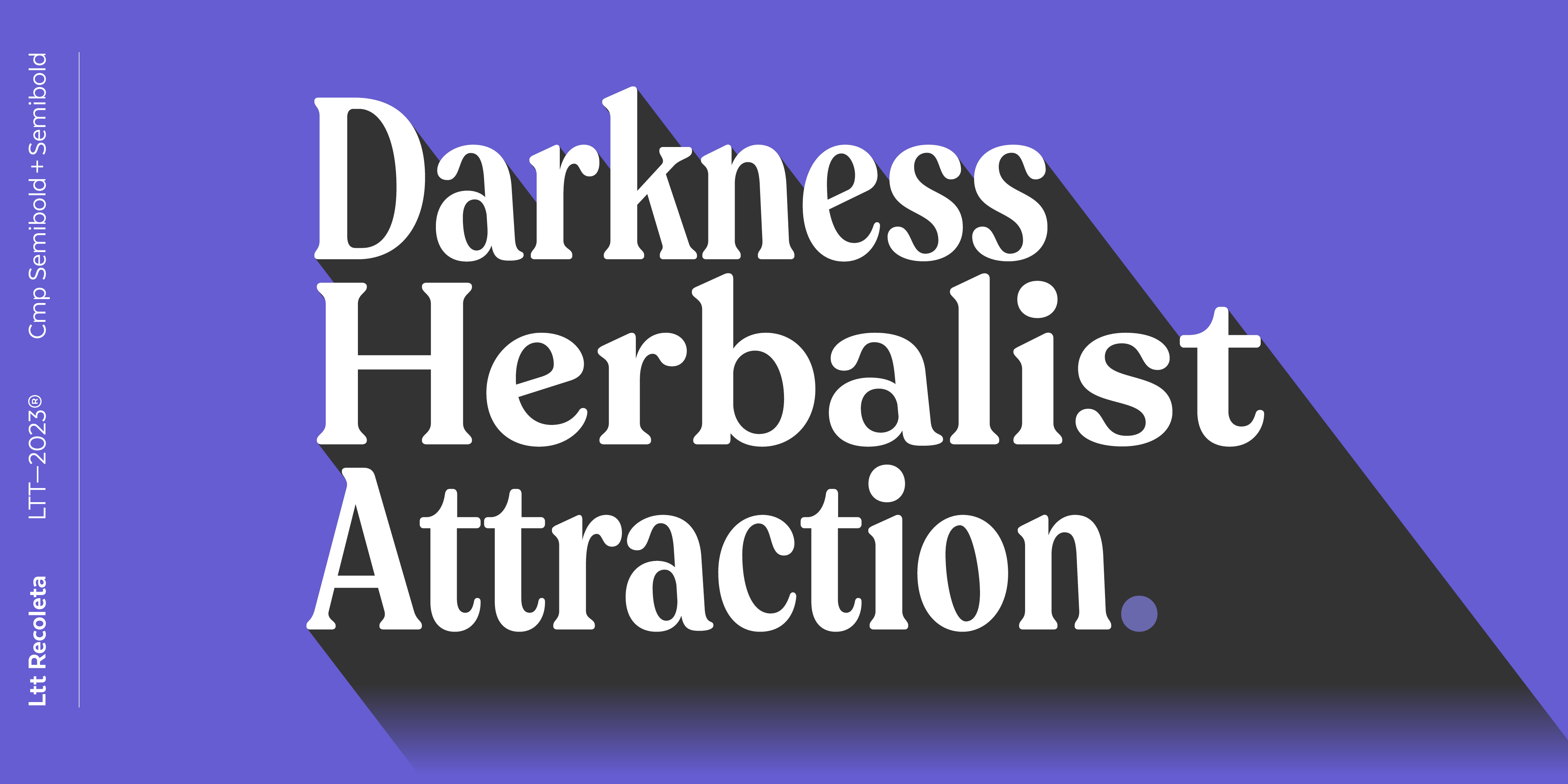
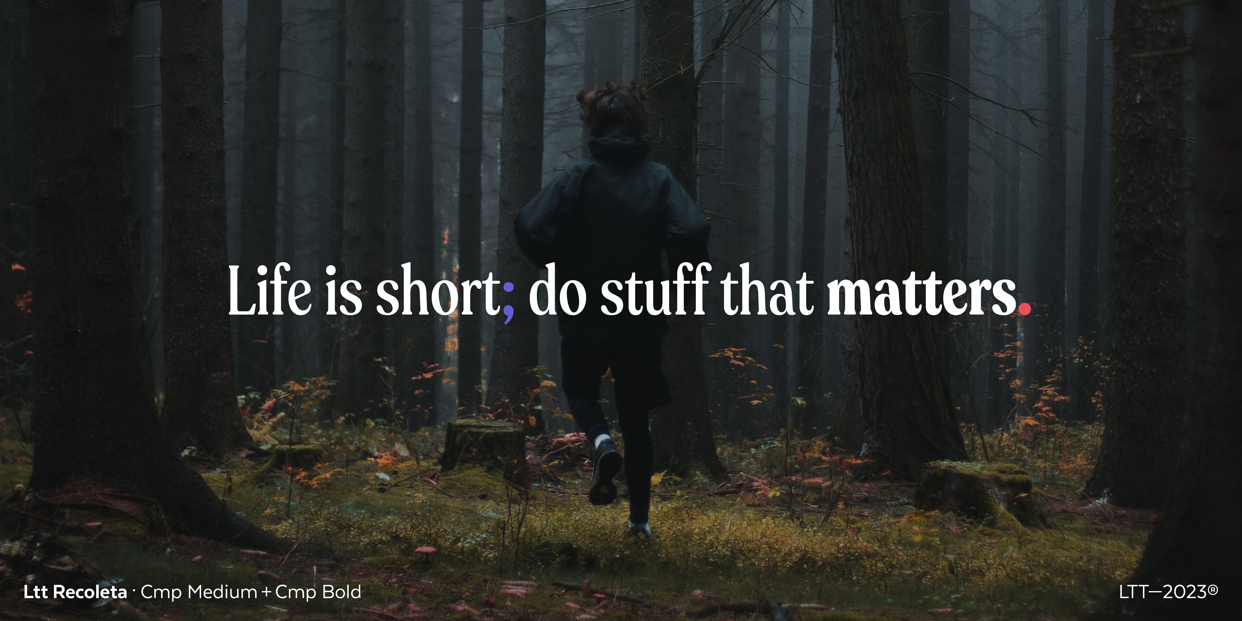
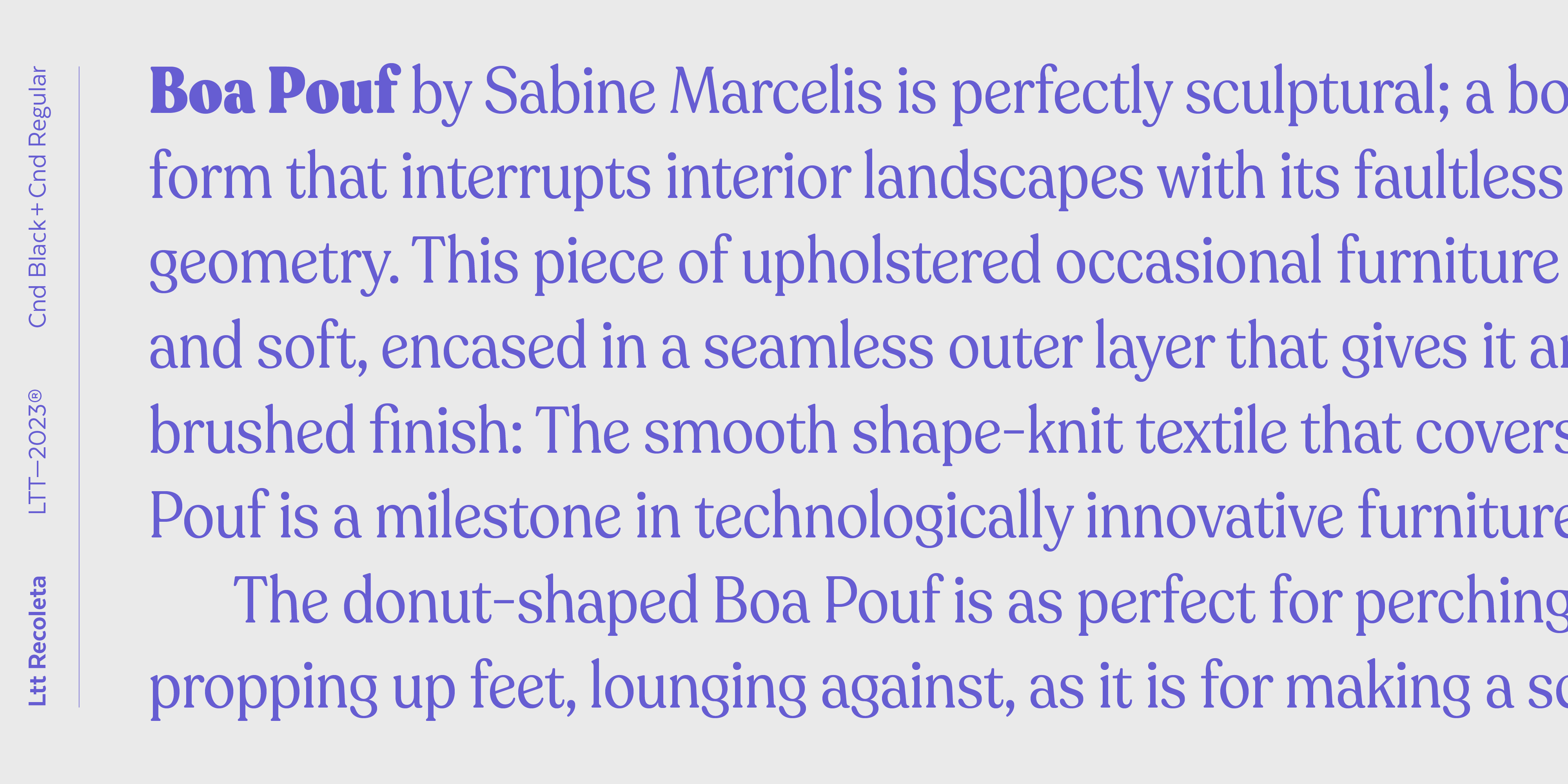
Recoleta New Version has 3 widths, one classic or standard, and 2 variants with diverse degrees of condensation. Each of the 3 widths has 8 weights, from thin to black. In addition, Recoleta has a number of stylistic alternatives, in both uppercase and lowercase, and in ampersand. On the other hand, Recoleta also supports the Cyrillic alphabet.
The new Recoleta takes as basis all the many virtues of its first version. It develops and extends them until it becomes a new typographic font, with more flow, taking beyond the disco spirit that made it a success.
If you’d like to inquire about special conditions, feel free to reach out to us at [email protected]