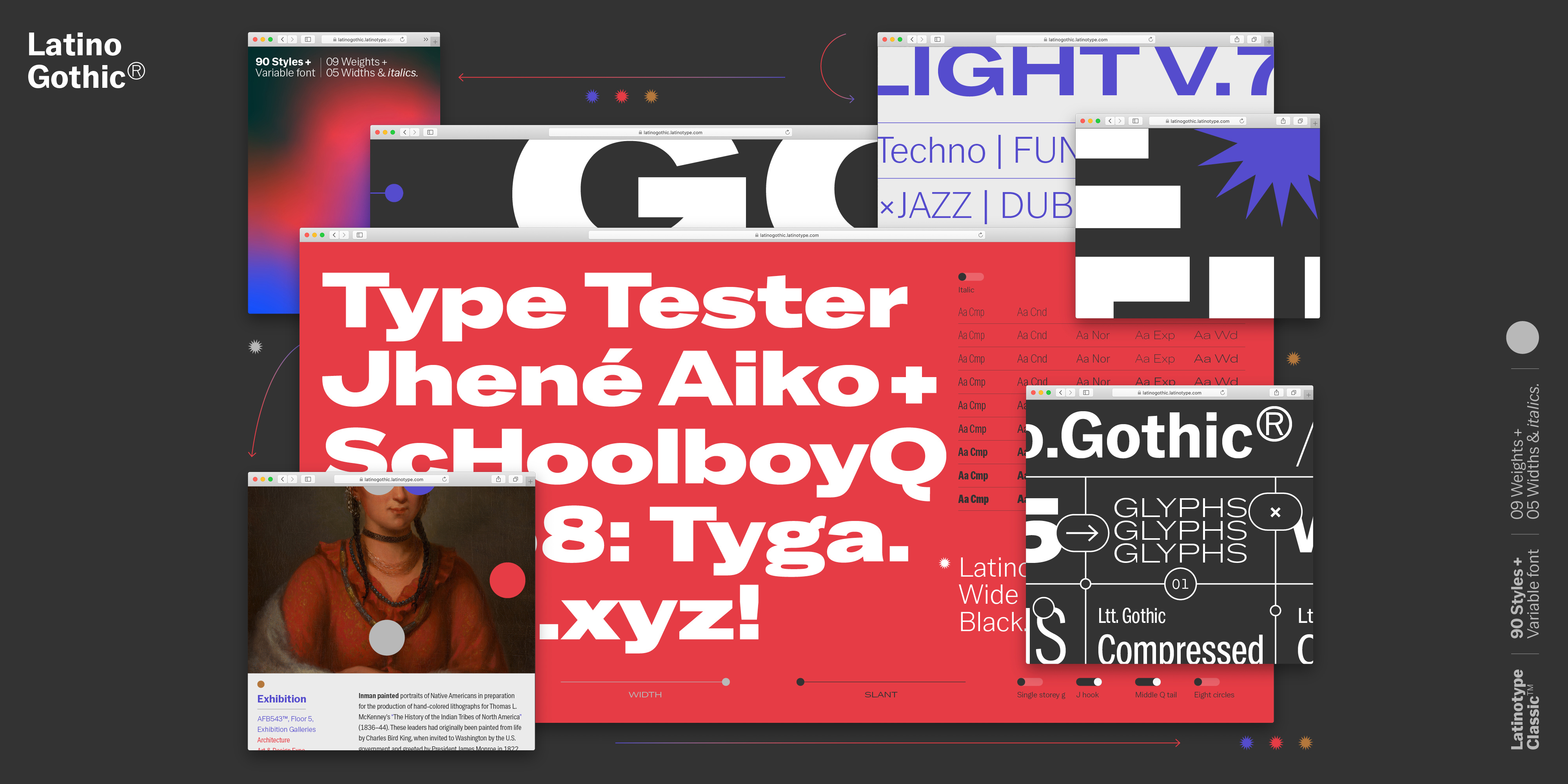
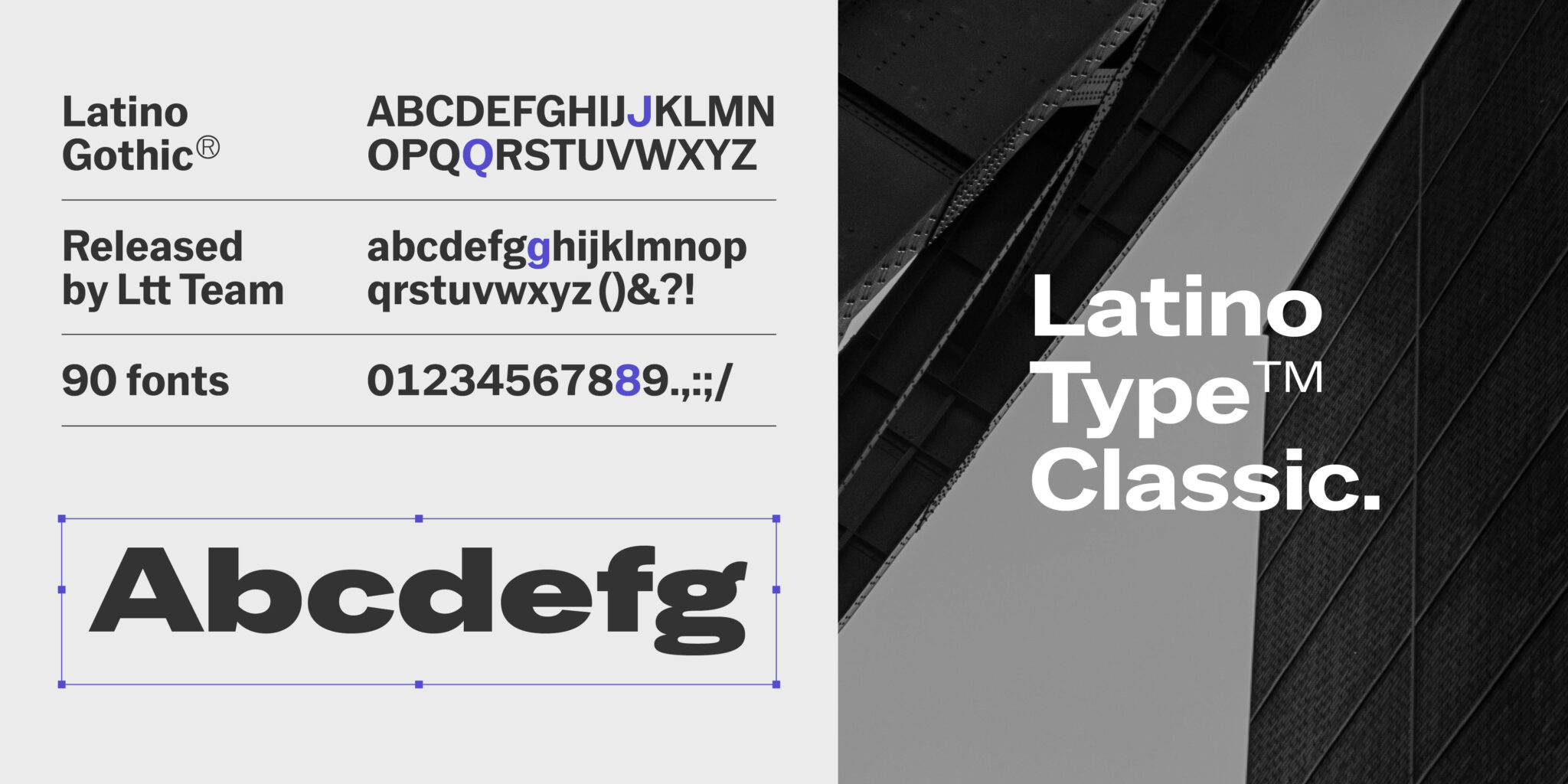
Latino Gothic®
Latino Gothic, everything you love about a classic gothic and everything you can ask for from a digital typeface
After two years of thorough and in-depth research, design and production work by the Latinotype team under the direction of Alfonso García, Latino Gothic arrives.
The genesis of Latino Gothic starts from the idea of finally bringing to the 21st century a typeface with the full presence of a centenary classic such as the Franklin Gothic and all the reliability, functionality and performance of a digital typeface of the latest generation.
Warmth, clarity, cleanliness, legibility, forcefulness, variability and all the bright inspiration of the gothic fonts, with the super classic Franklin Gothic as a reference point. Latinotype collects and condenses this spirit and brings it to the present through Latino Gothic, a Latin touch with a lot of character for a centenary typographic style.
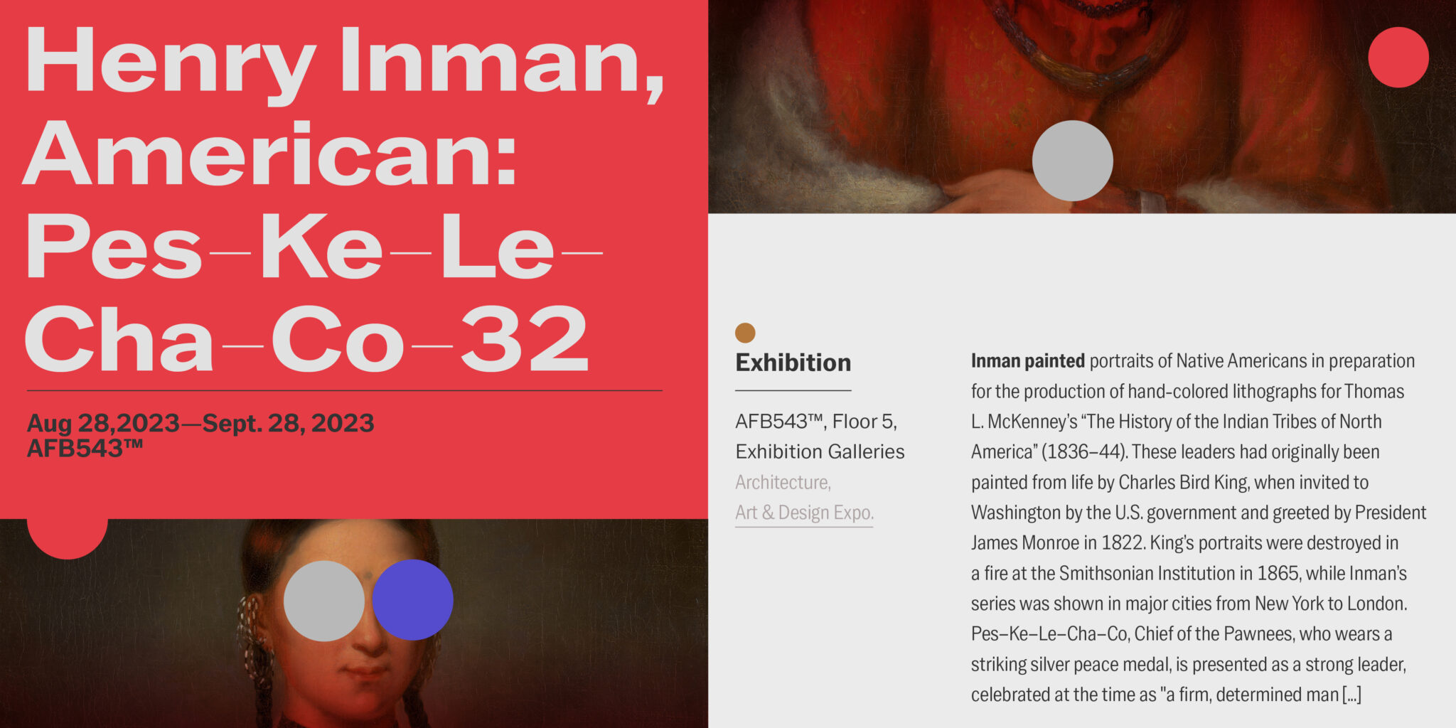
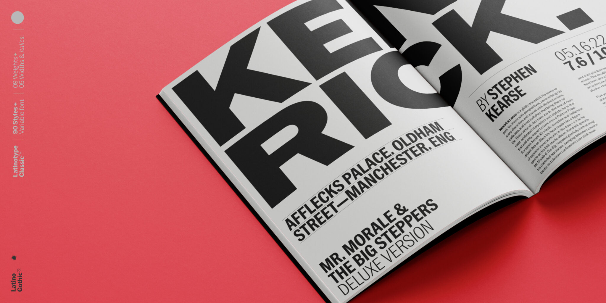
The classic Franklin Gothic was designed by the legendary American type designer and engineer Morris Fuller Benton and published in 1905 by the American Type Founders (ATF), and it quickly became a huge success. Benton’s original design was limited to a single bold weight with the idea that it would work as a display for signage, advertising and press headlines. It has been 120 years since this classic typeface saw the light and in Latinotype we considered the need to design a contemporary font perfectly adapted to the needs of the 21st century from that iconic model. The result is Latino Gothic.
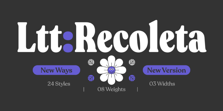
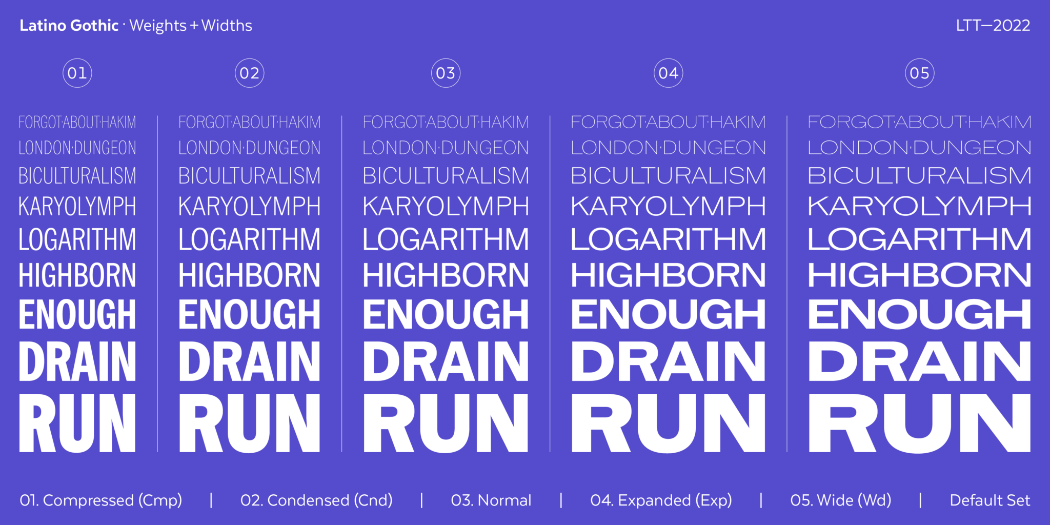
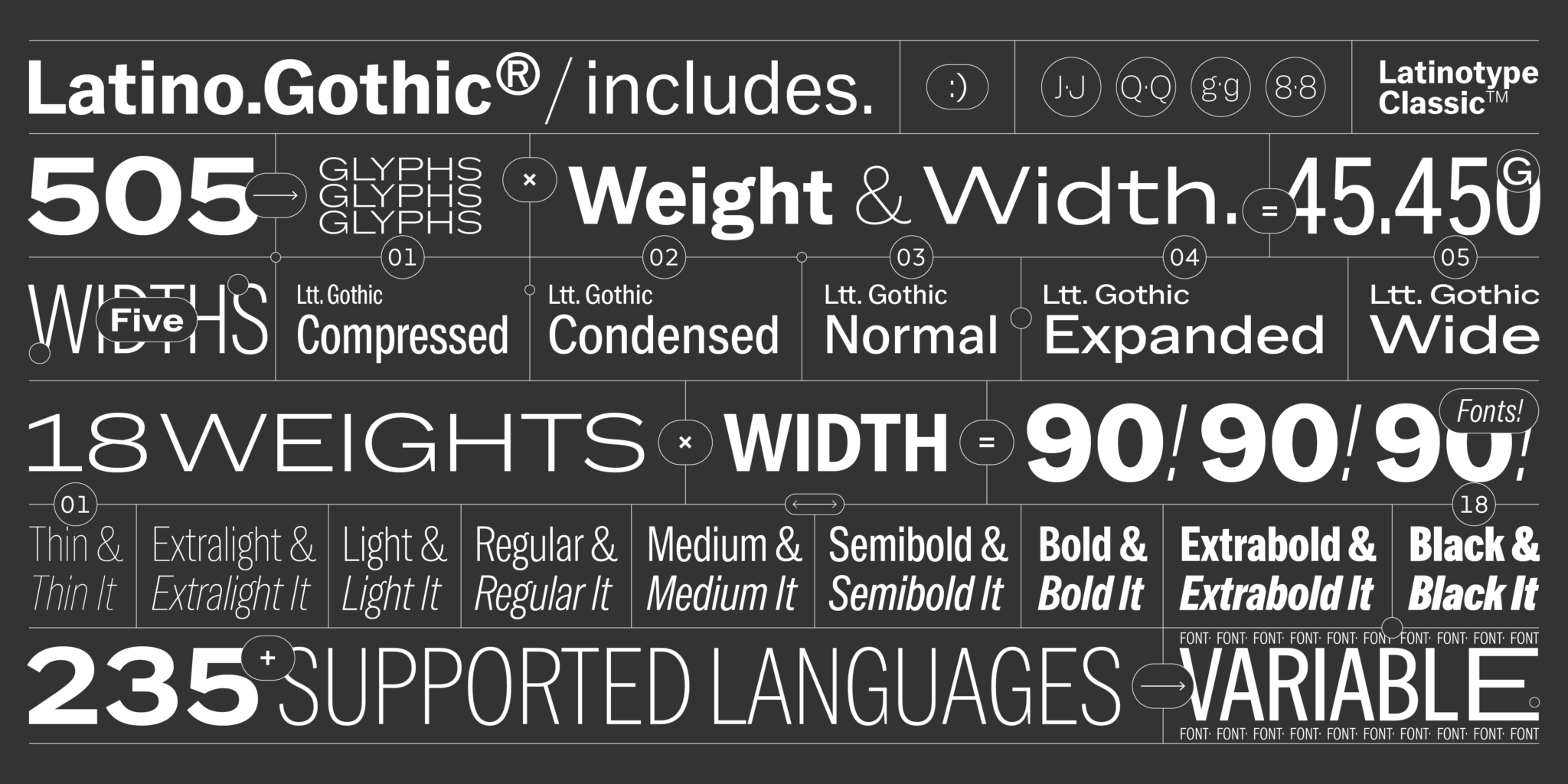
Latino Gothic is a super family that offers a novel interpretation of the original design fully focused on the needs of 21st century visual communication. Latino Gothic is designed to meet the most varied communication needs thanks to its 5 widths and 9 weights, with their respective italics, and of course, thanks to its variable version, where you will have all the possible options in a single file. 90 different styles that make it the most versatile and complete gothic super family on the market.
Thanks to the huge variety of options it offers, versatility is another of its hallmarks. During its long and meticulous creation process, we have carried out countless design tests. One of the most important and decisive ones is the test performed by the graphic designer of the Latinotype team to check its degree of usability when it’s still possible to make decisions that will affect the final result. After all, it will be the graphic designers who give life to Latino Gothic through their use decisions.
Design decisions are made as a team and each member brings their vision from their field and their professional experience. This working method provides each typeface from the Latinotype factory with the formal nuances, conceptual depth and technical performance of a precise, reliable and beautiful typographic product.
Latino Gothic is undoubtedly a 21st century classic, Latinotype’s tribute to the Franklin Gothic. But the classics were designed for 12 metal points. Nowadays, in the 21st century, the screens dominate the field of typography and the sizes in which typefaces are used, even in print media, are extremely varied. And the type designer who wants to bring functional typefaces to the market has to be aware of it. The features of Latino Gothic are designed for all possible sizes, in all weights and styles and, of course, in its variable version.

Optical corrections are one of the most delicate and meticulous design processes. Here comes into play the expertise and knowledge of the architecture of the letters of our typographical designers. During the design process of Latino Gothic, we have taken into account all the possible and varied circumstances that our typeface could experience. In today’s digital typographical environment, a typeface can appear in an extremely wide variety of sizes. Modulations between thick and thin strokes of the letters always pursue formal harmony whatever the size of the letter is.
The limit we want to break is that of traditional typography and we try to expand it through the vision of graphic design. What are graphic designers looking for when choosing fonts? With that question in mind, we have built the Latino Gothic super family.
And for this reason, it possesses an enormous range of possibilities rarely seen until now in a typeface of its characteristics.
Its classic and contemporary character at the same time, its technical performance and its high usability make Latino Gothic ideal for all kinds of design projects, from the most purely editorial ones, to branding, packaging or signage. Put it to the test, give it a chance to get everything out of it. Its 90 styles challenge the creativity of the boldest designer.