Fonts & Sports
When Letters Play Too
Beyond the result, sport is built as a carefully designed visual experience. Among jerseys, scoreboards and screens, typography plays a key role in how we understand and experience sport. Below, a look at this graphic universe that often goes unnoticed.
If you are a fan of football, basketball or motor racing, it is likely that sport, in visual terms, feels like familiar territory. The colours that return season after season, the team logos recognised from a distance, or the almost choreographed energy of a full stadium on any given weekend.
However, there is one element that rarely takes centre stage, even though it runs through everything: letters. When we think about sport, we almost never do so from this perspective. And yet they are present in the numbers that identify each player, in the surnames stitched onto jerseys, in the scoreboard that tracks the pulse of the match and in the headlines that turn a result into a story.
In team sports such as football, basketball or rugby, where information multiplies and visual noise overlaps, typography helps establish hierarchy and bring clarity to intense scenarios. Even in practices such as Zumba, where sport is experienced through rhythm, movement and the body, typography supports the experience through screens, graphics and visual systems that organise and amplify the energy of the group in motion.
In more individual disciplines such as tennis or karting, the typographic gesture takes on another dimension. A name, a number or a graphic detail can become part of an athlete’s identity. In these cases, typography stops being only a functional support and begins to operate as a visual signature, designed with the same care as any other element in an identity system.
Latinotype’s Experience on the Field
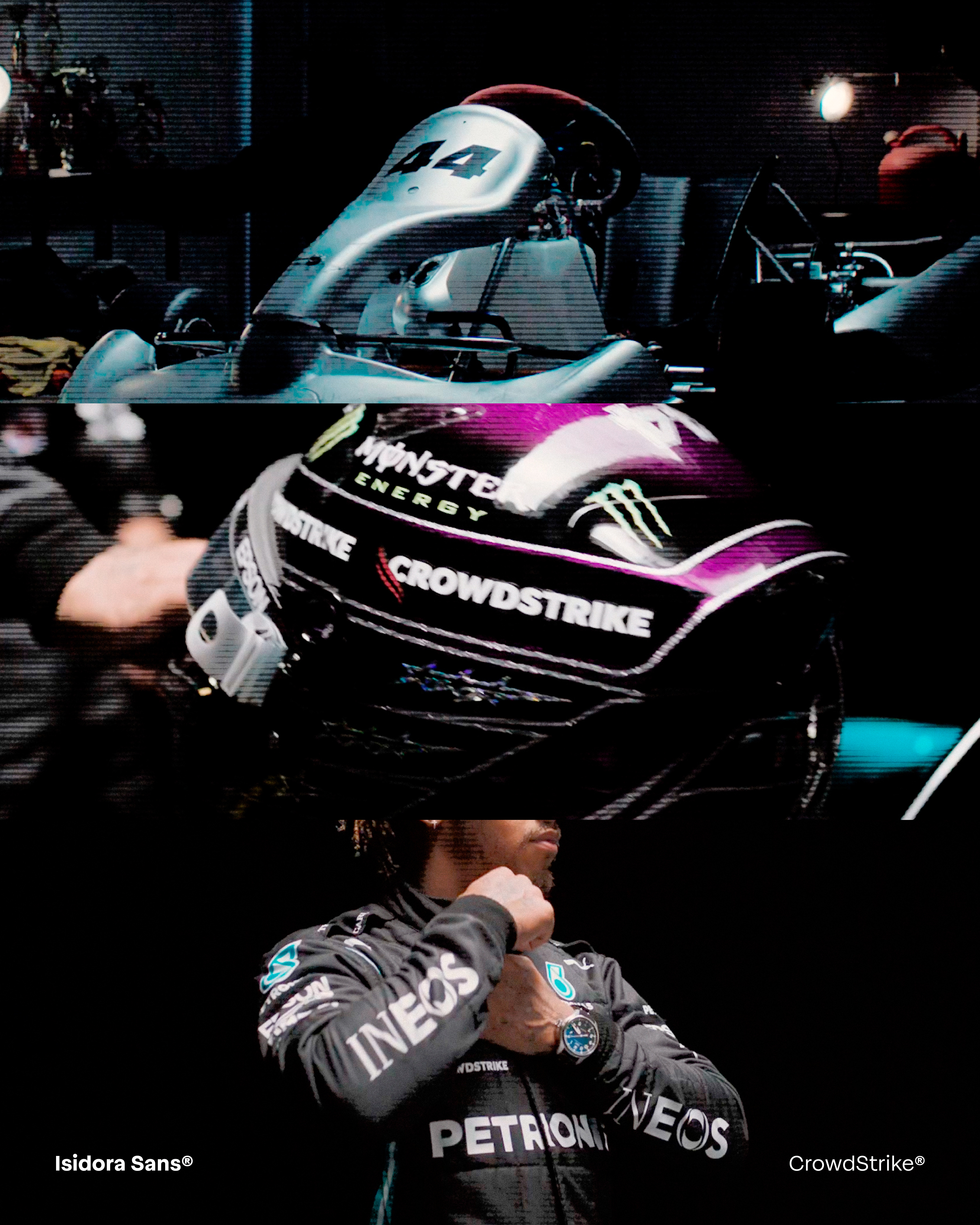
In sport, typography is much more than communication. This is something we at Latinotype know well. When CrowdStrike, a brand with a recognised presence in motorsport, chose “Isidora”, a typeface from our historical catalogue, as part of its rebranding, the challenge lay in versatility. The diversity of formats and substrates required a system capable of maintaining legibility and character in very different visibility contexts.
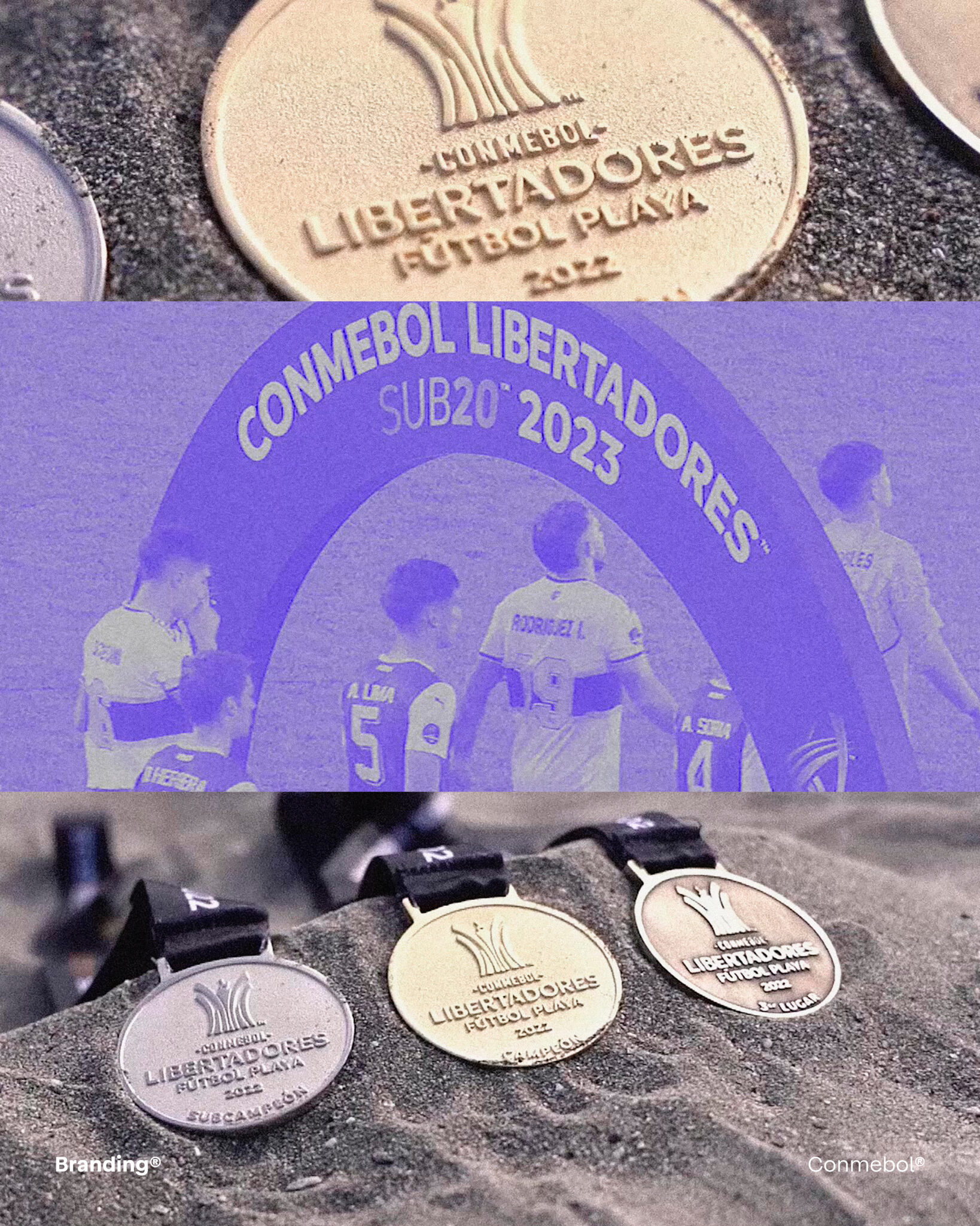
Something similar happened with “Branding”, one of the most recognisable typefaces in our catalogue, present in competitions such as the Conmebol Sudamericana. In an environment saturated with stimuli, it introduces a certain visual calm. Building hierarchies without overemphasising them and allowing the game to remain at the centre of the scene.
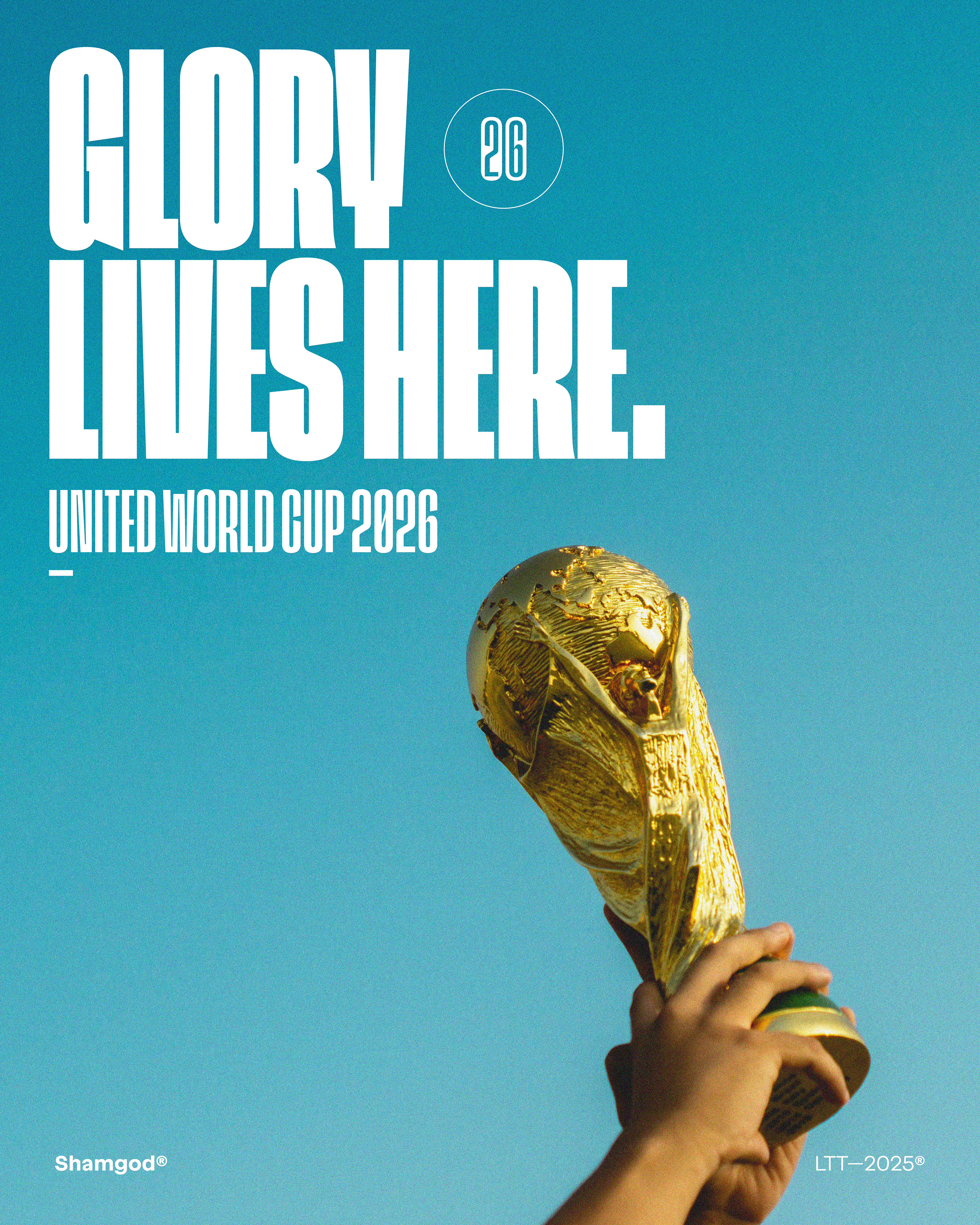
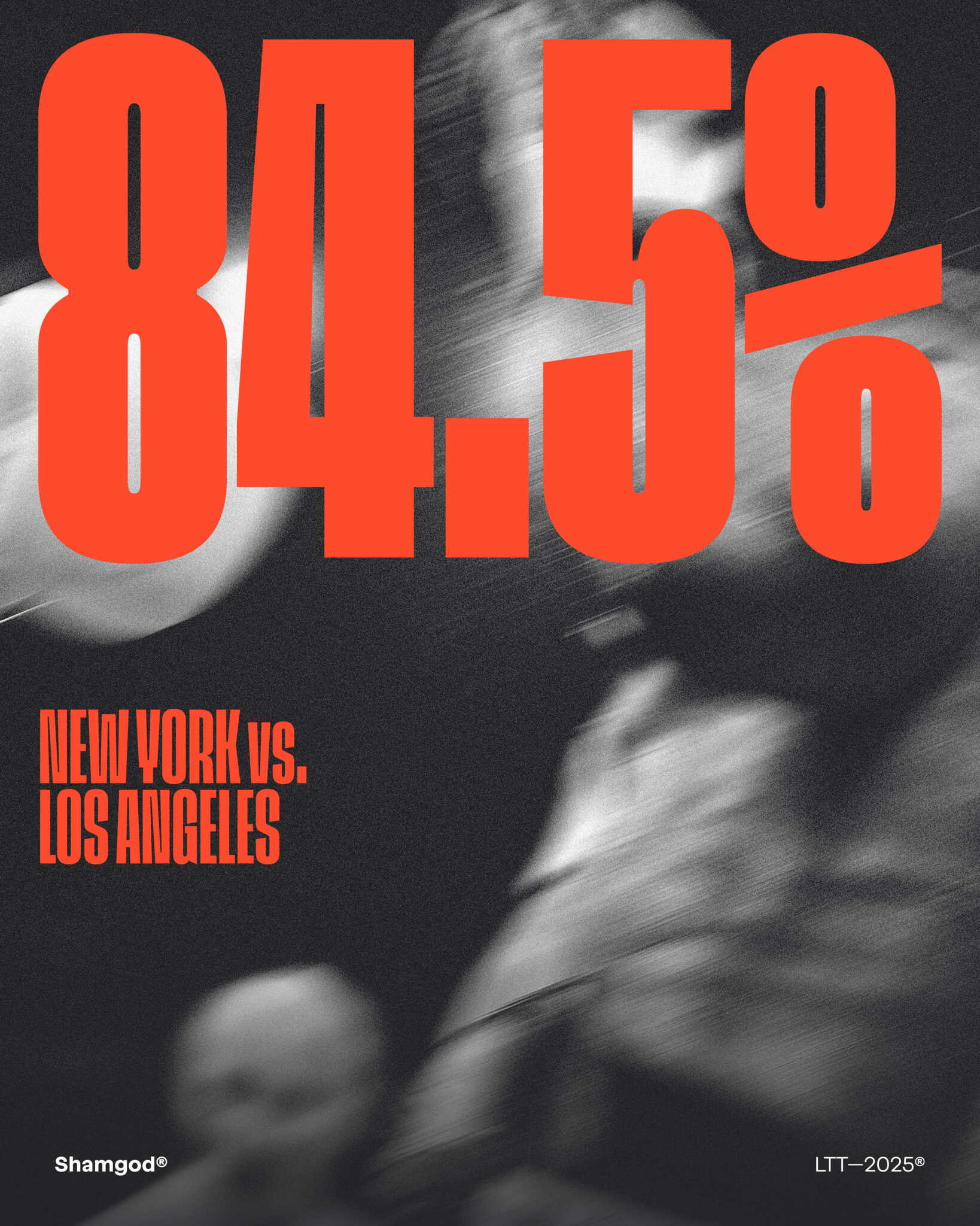
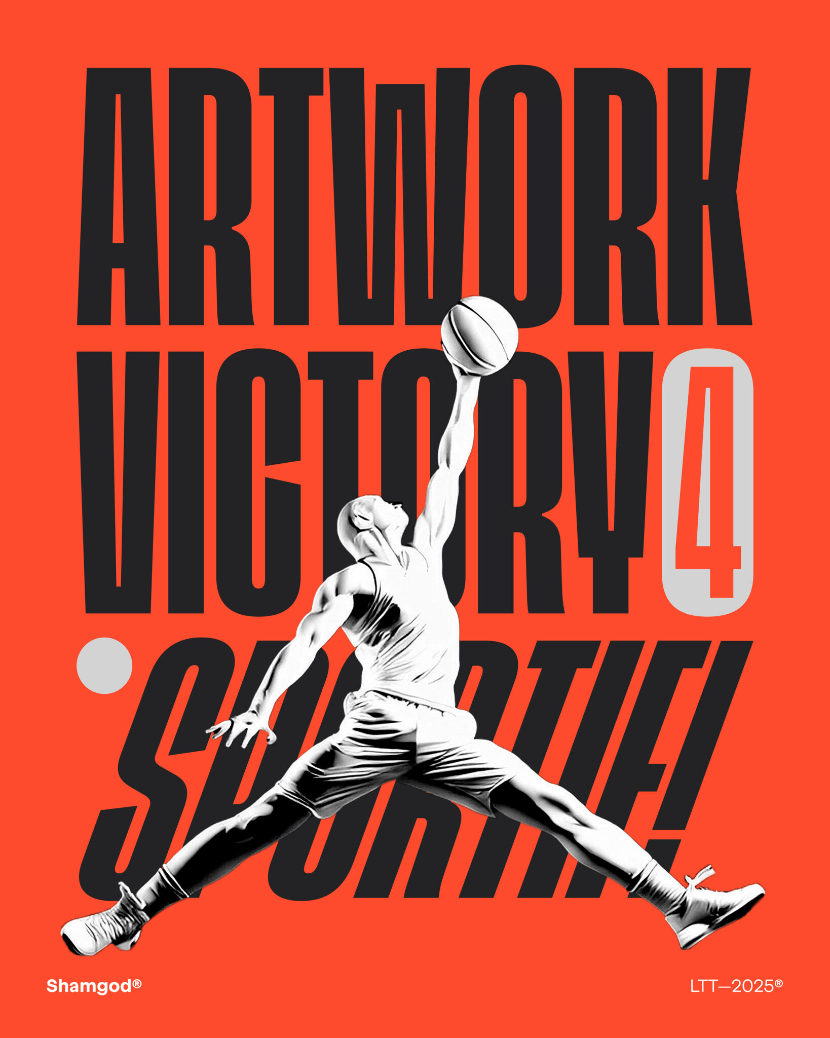
But sport also has moments when that control breaks. Instances of friction and accumulated tension, where communication needs to be immediate. In that territory appears “Shamgod”, another typeface with the Latinotype signature. Condensed, dense and with a strong urban imprint, it engages with speed and impact, working especially well in tournaments where everything is decided in seconds.
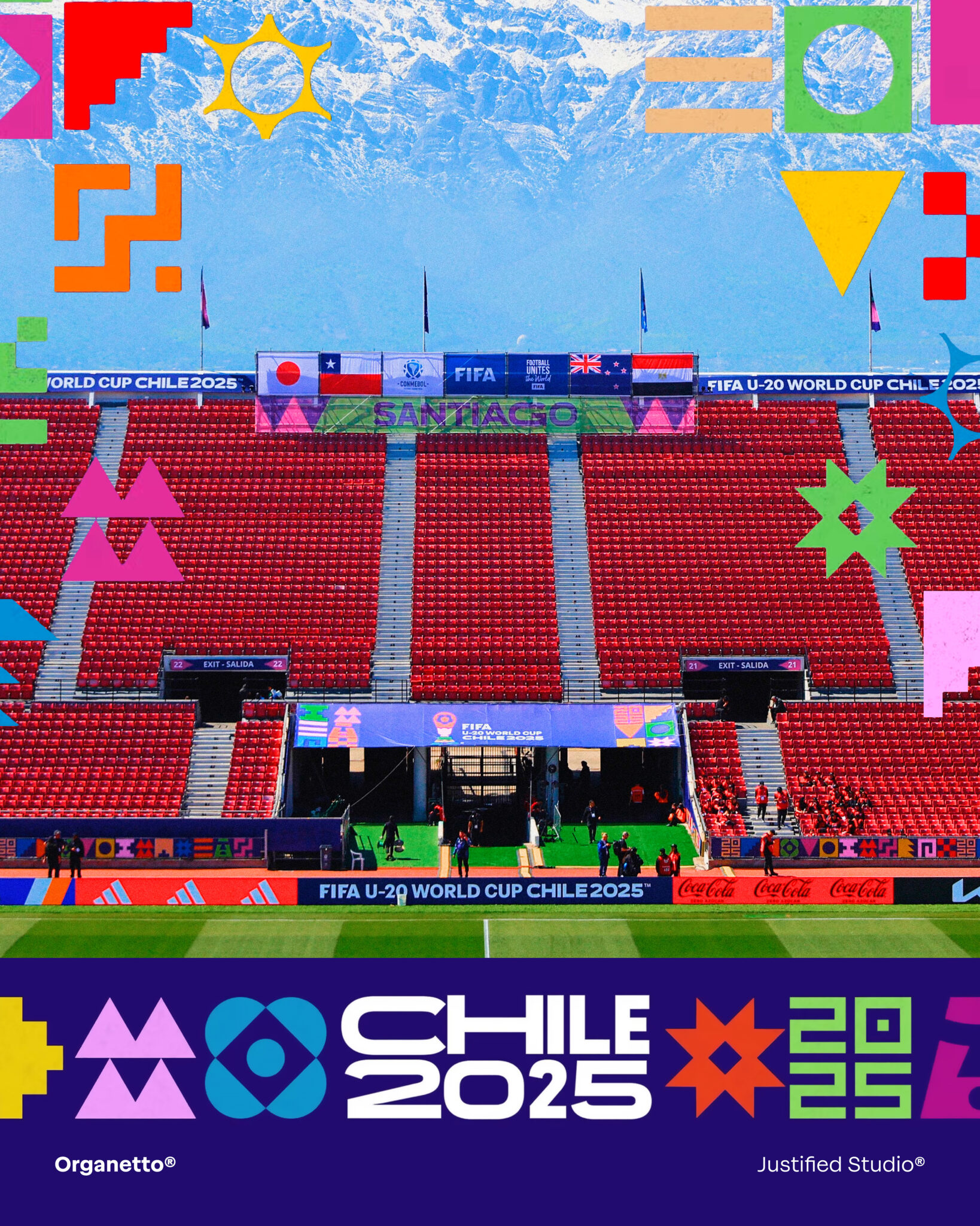
In a more flexible register, our typeface “Organetto” responds to a key condition of contemporary sport, constant adaptation. Its multiple widths and weights allow information to adjust to different formats without losing coherence. From jersey to screen, from signage to editorial support, typography accompanies fans without becoming rigid.