Melitta
One Font License. Three Scripts. One Melitta.
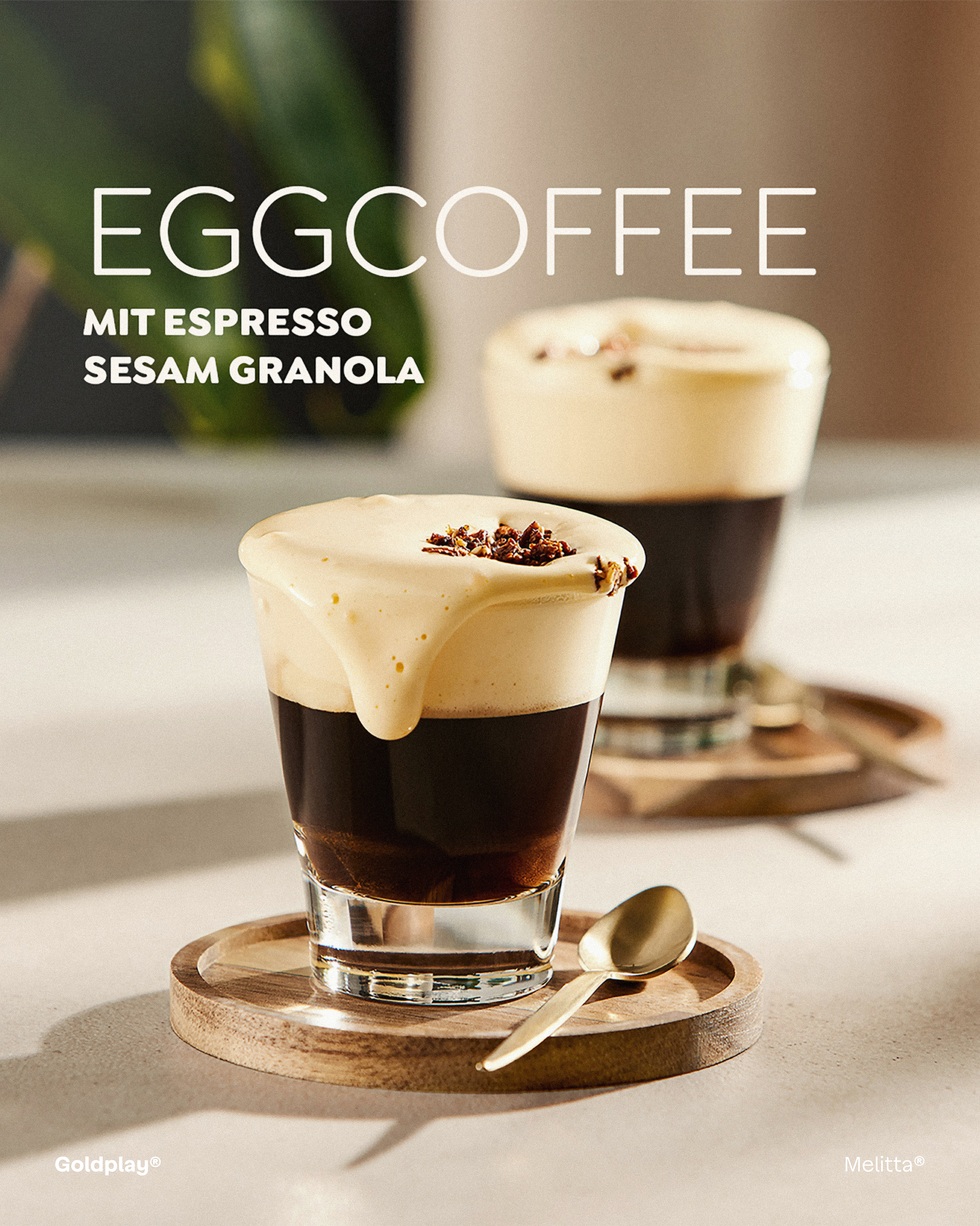
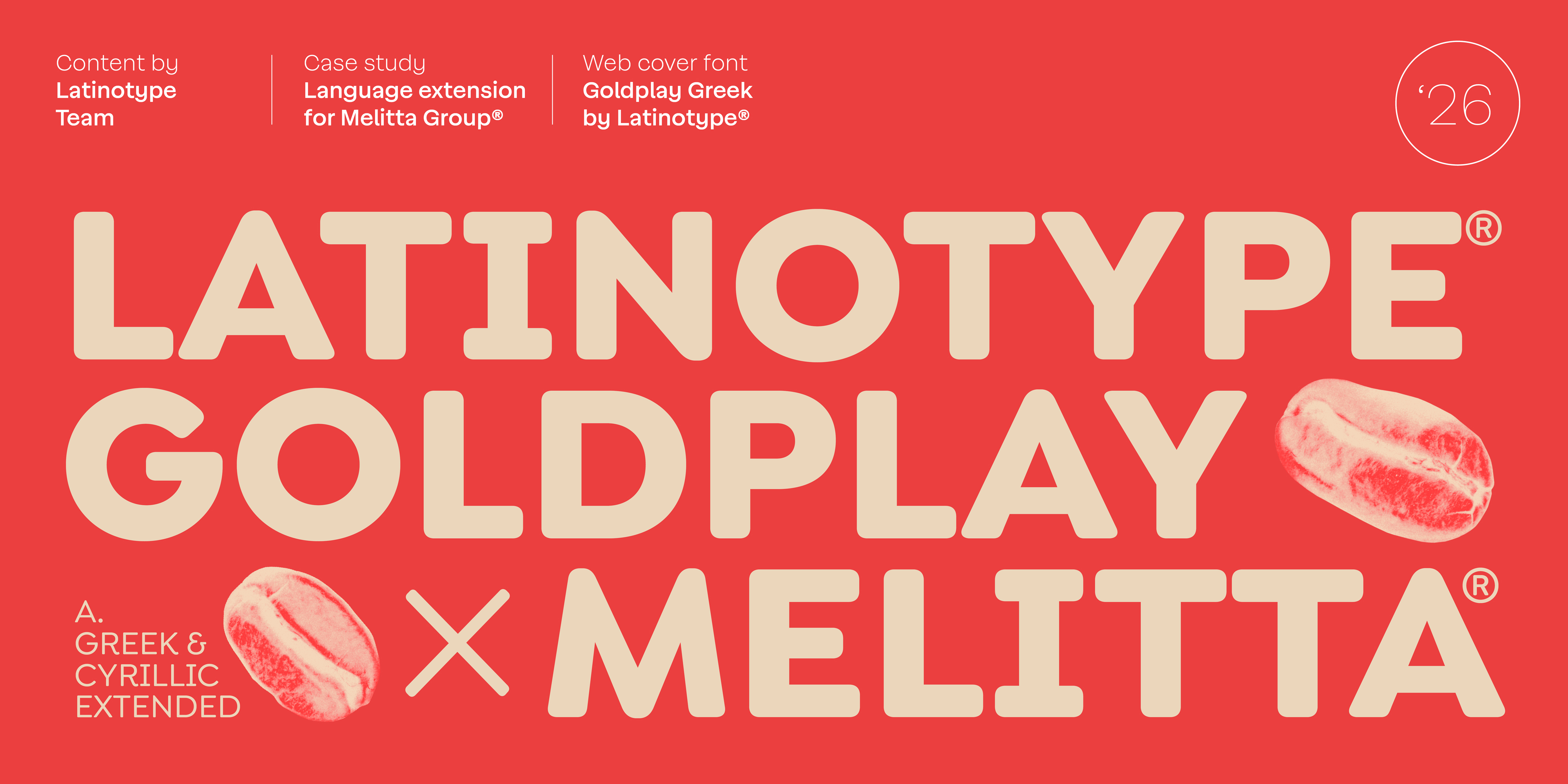
Melitta, the global coffee brand present in over 50 countries, commissioned Latinotype to extend Goldplay — its corporate typeface — to include Cyrillic and Greek character sets, securing consistent brand identity across every market through a single enterprise font licensing agreement.
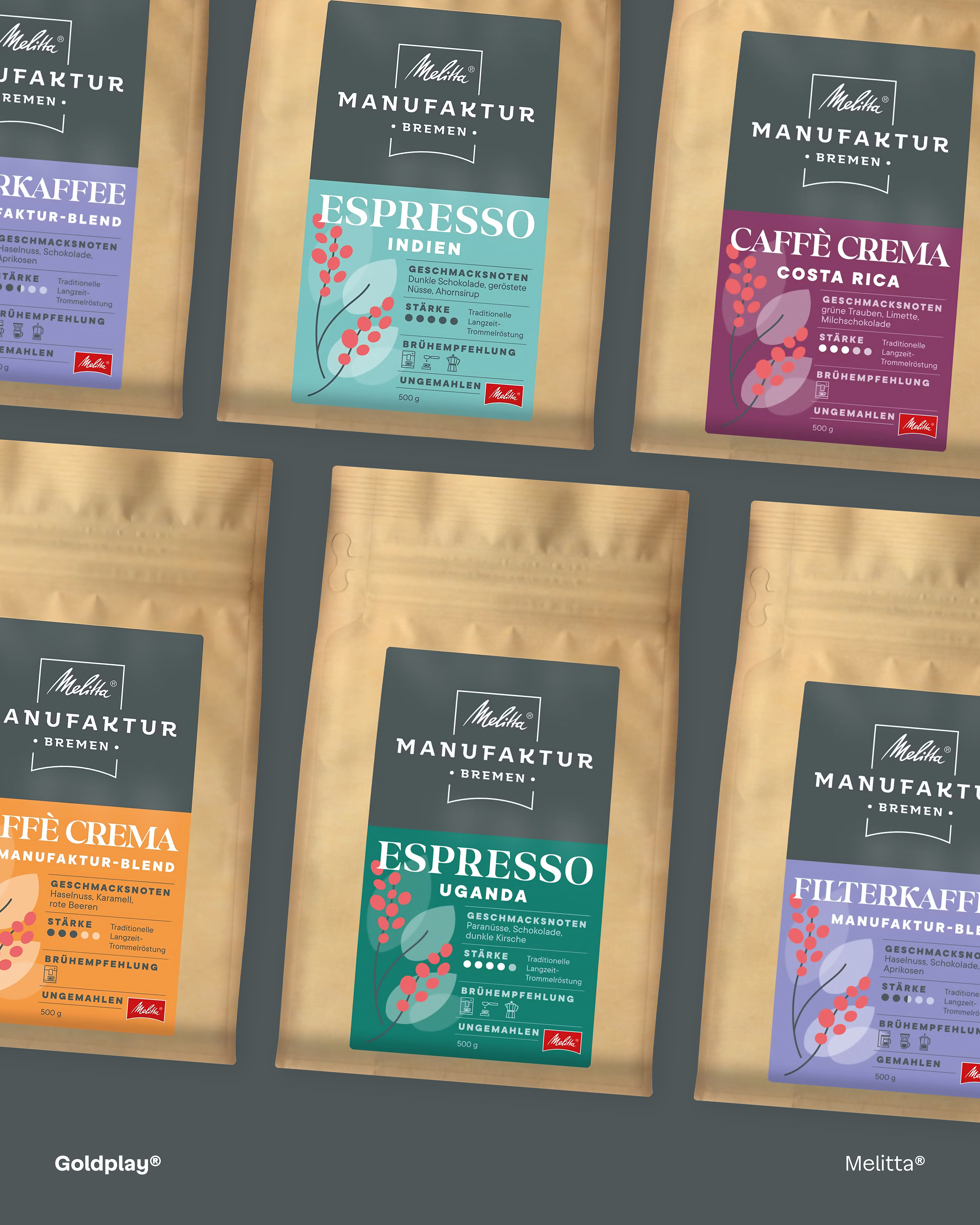
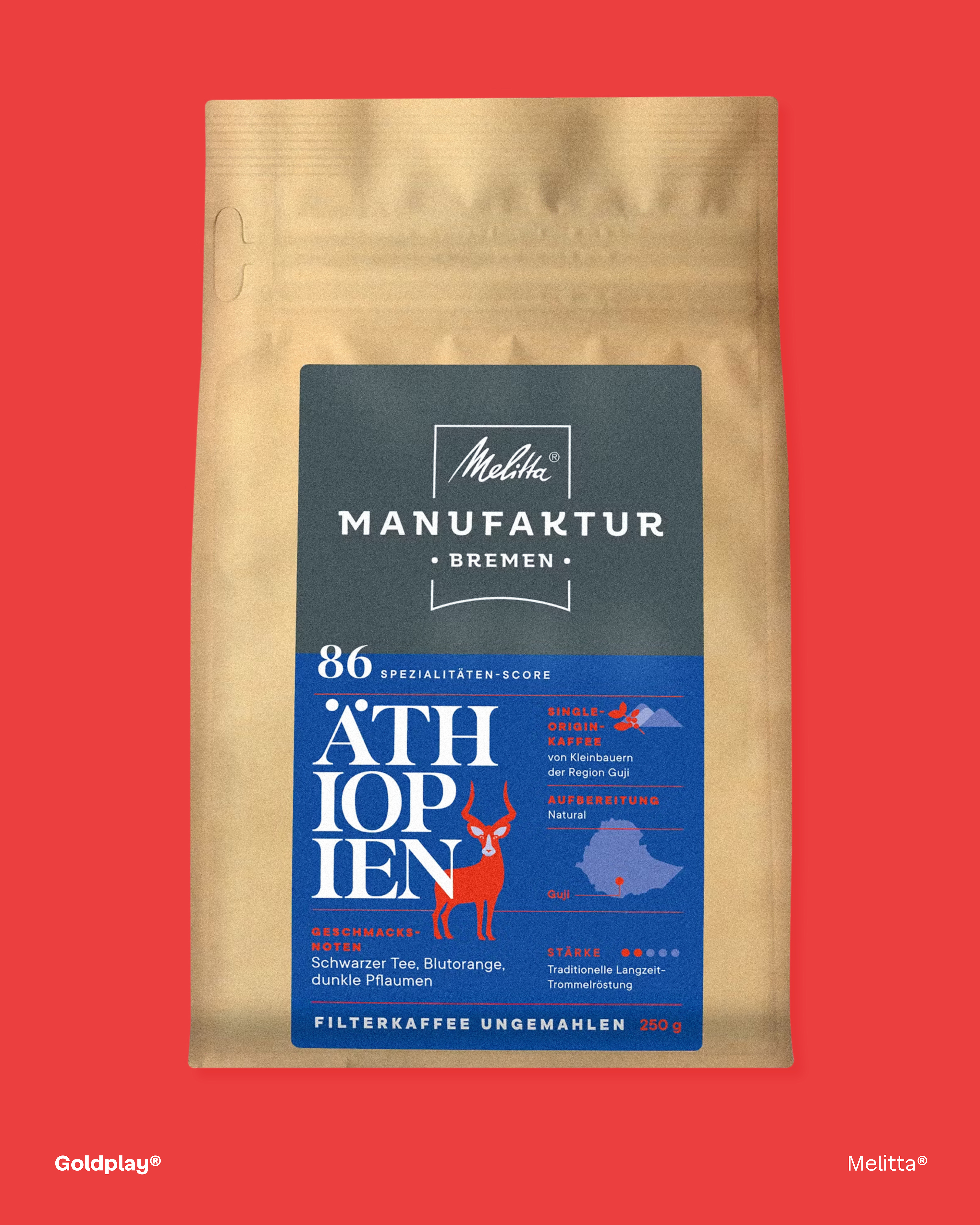
Founded in Germany in 1908 and inventor of the paper coffee filter, Melitta adopted Goldplay as the cornerstone of its renewed identity in 2021 — a rebrand that earned the German Brand Award 2022. Designed by Enrique Hernández, this geometric sans serif balances precision with rounded terminals: technical enough for a century-old innovator, warm enough for a brand woven into millions of morning rituals.
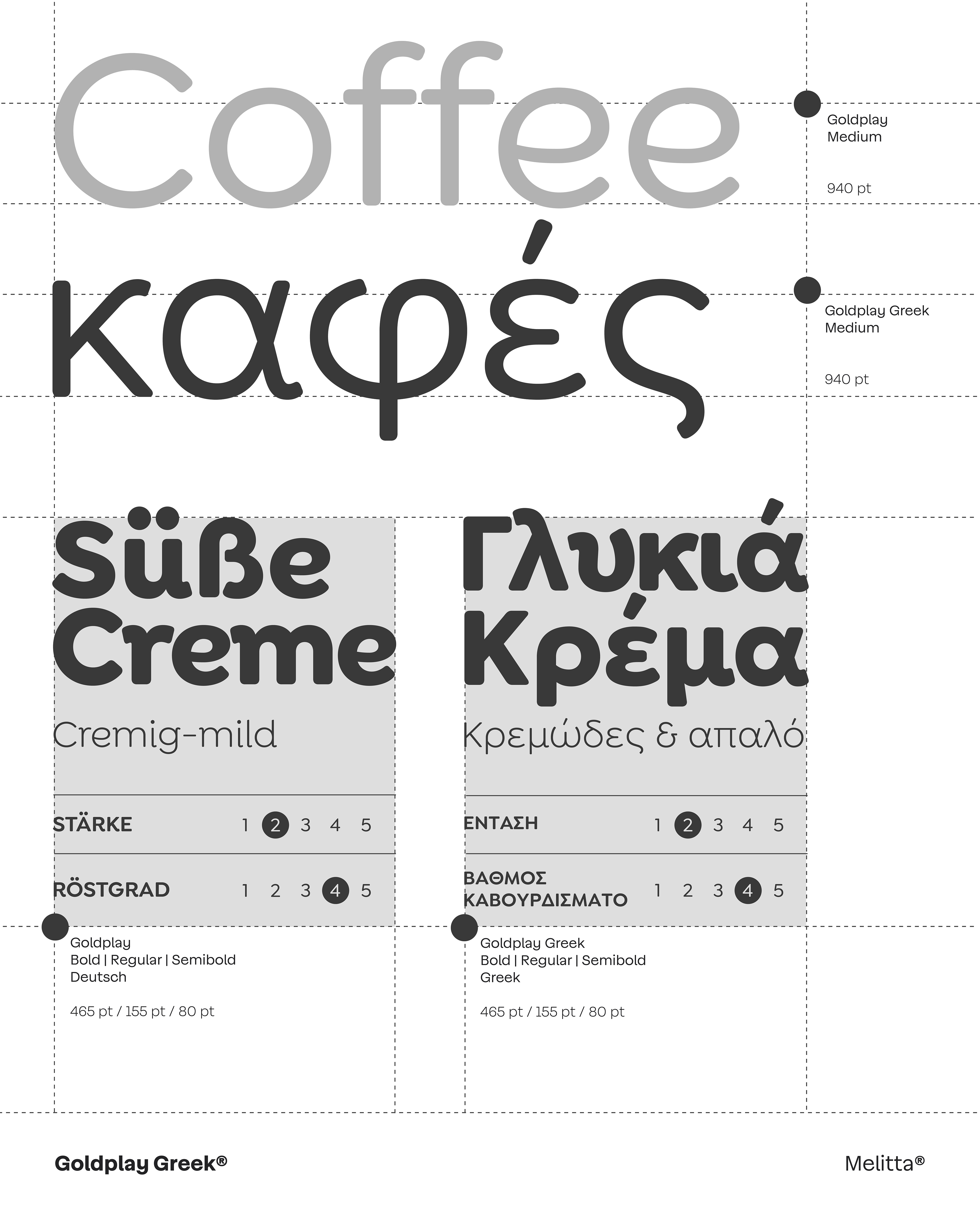
The challenge was straightforward: Goldplay only covered the Latin alphabet. To maintain brand coherence in Russia, Greece, and beyond, every new character had to feel like a natural extension of the same family. Latinotype designed Cyrillic letterforms — Д, Ж, Ц — from scratch, and resolved Greek descenders in η and μ to match the depth of their Latin counterparts. Native speakers confirmed that each form adhered to local typographic conventions without compromising Goldplay’s visual DNA.
The result is a three-script system that reads as one. When German, Russian, and Greek appear together on packaging, websites, or presentations, everything feels like Melitta. Brand identity doesn’t depend on language — language adapts to the brand system.