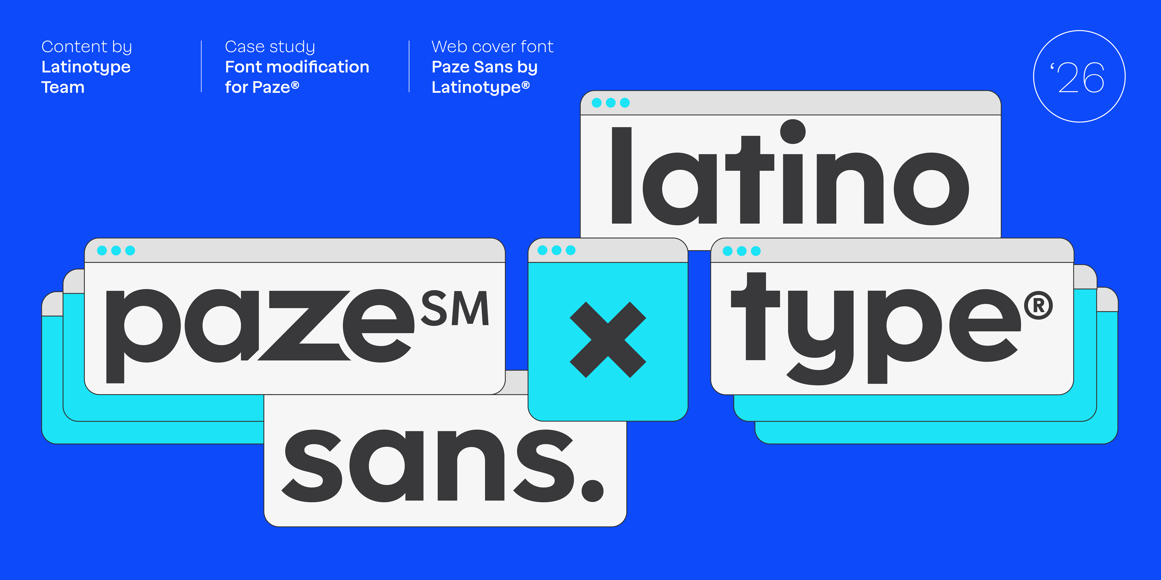
Paze Sans
A Custom Typeface Design Built for Banking Scale
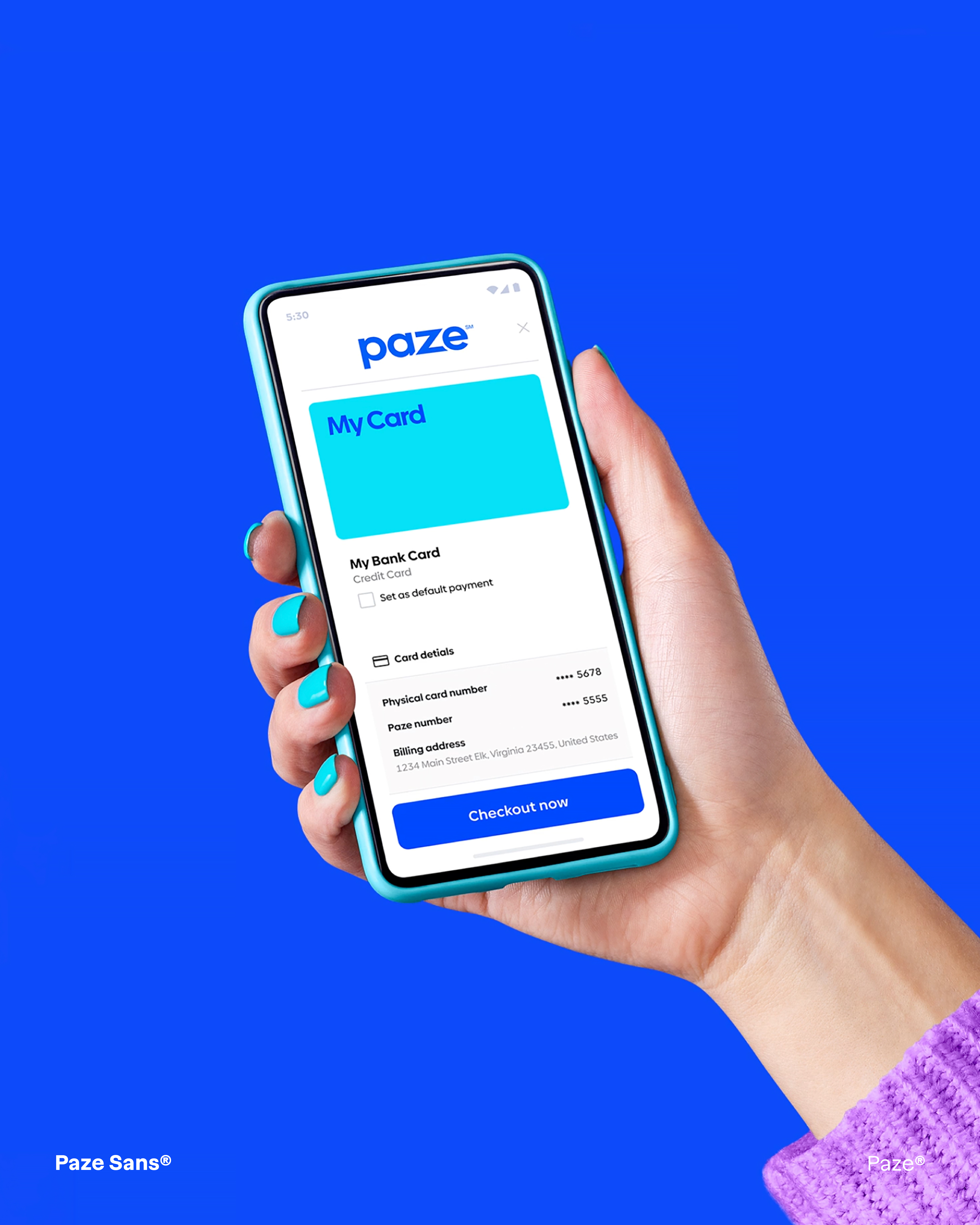
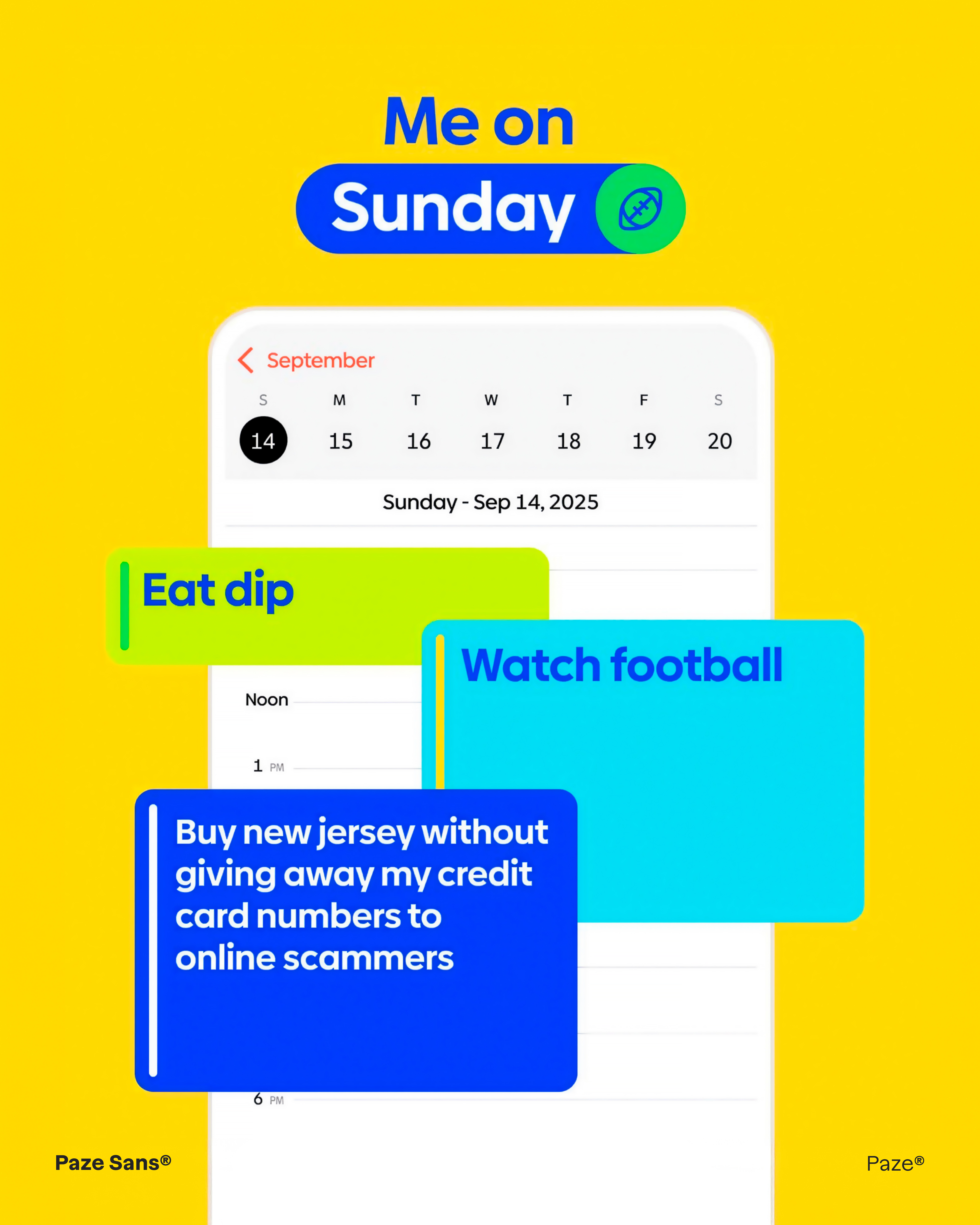
In a checkout button, every detail competes for trust in under a second. When Early Warning launched Paze — a bank-backed digital wallet offered by Bank of America, Chase, Wells Fargo, and five other major U.S. institutions — the identity needed a typeface that could carry that trust across 125 million eligible cardholders, from a mobile button to a billboard.
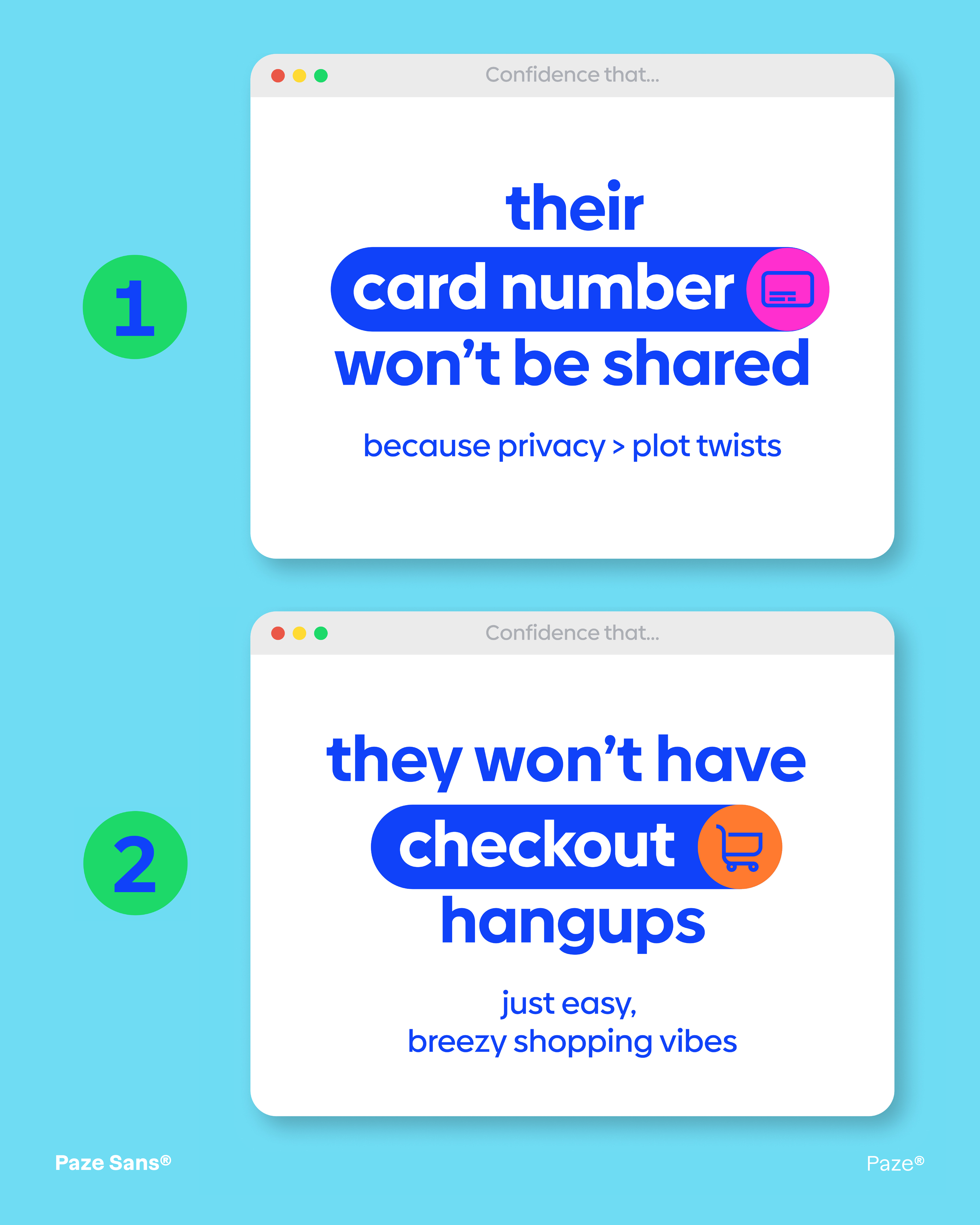
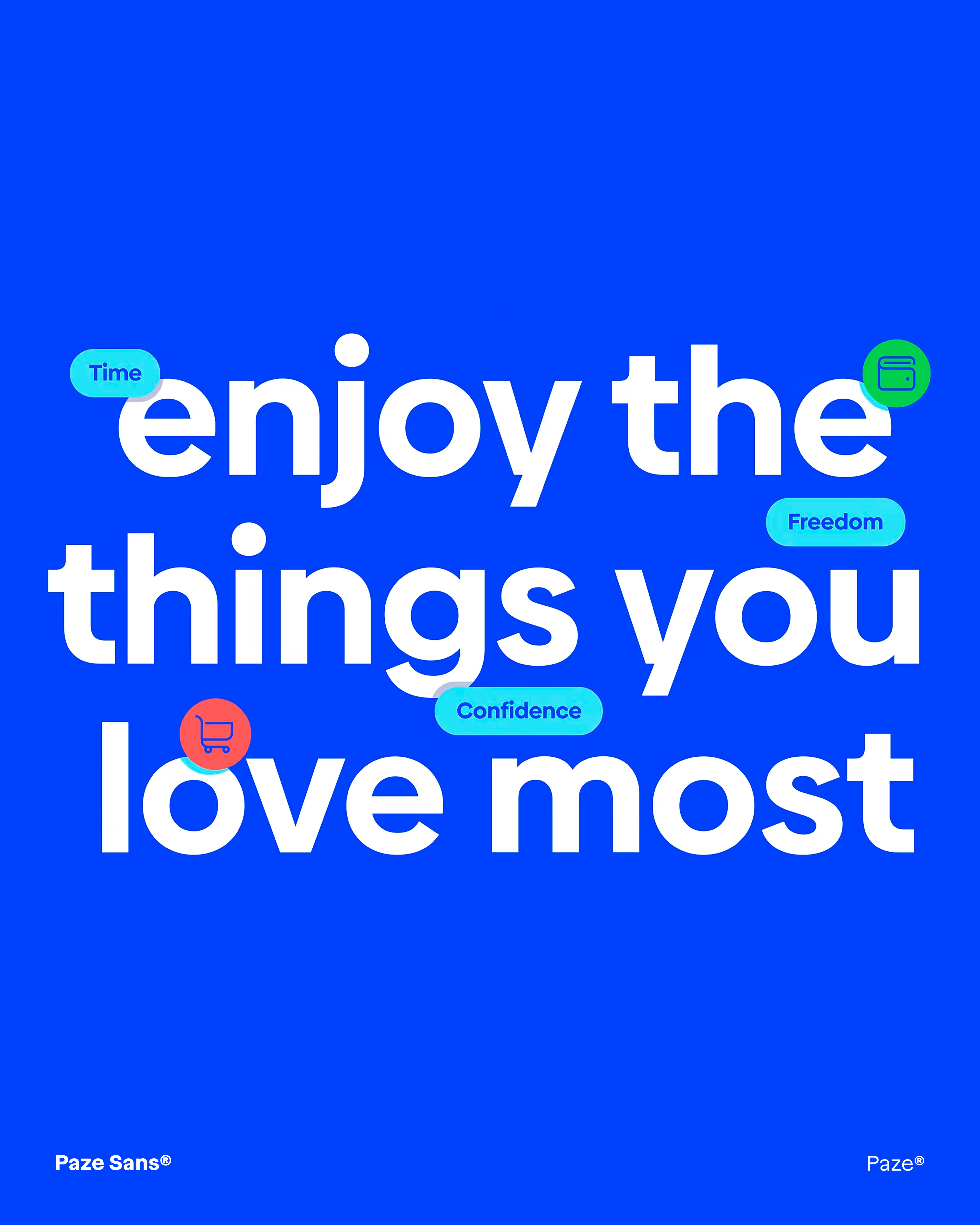
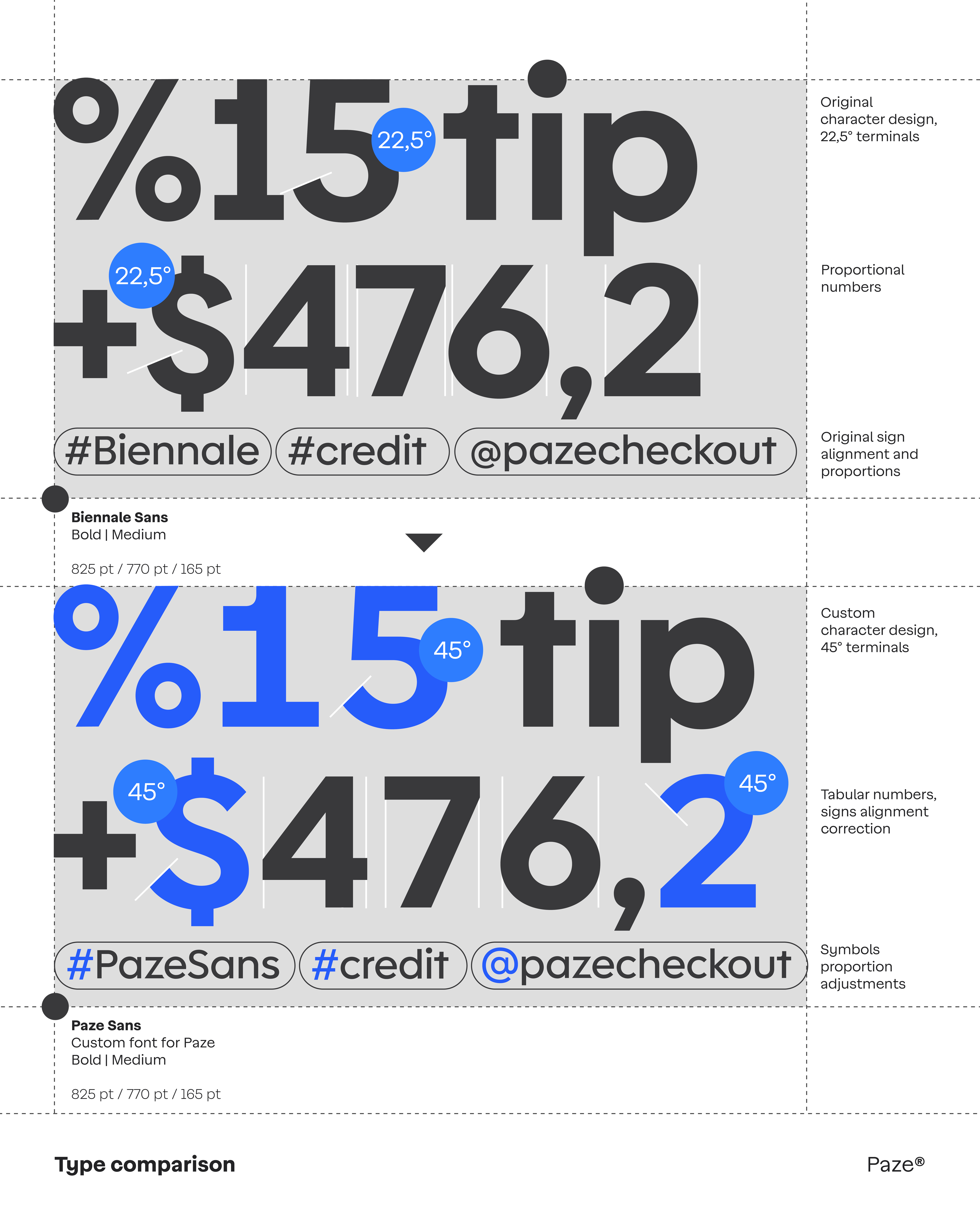
Biennale, Latinotype’s geometric sans serif with strong x-height and clean proportions, was the right structural foundation. Its character — precise without being cold, confident without being loud — aligned with what Paze needed to communicate: the security of your bank, the speed of modern checkout. But a corporate identity on a banking scale required more than a license. It required a typeface built from the ground up for the brand.
Latinotype delivered Paze Sans in 7 weights with italics and a dedicated text Regular. The process covered the full typographic system: uppercase and lowercase design, numerals, and a complete character set including diacritics, punctuation, and mathematical symbols.
One technical detail defines the project, highlighted by type engineer César Araya: every time a Z appears in text, a contextual alternate triggers automatically — replacing the standard letterform with the notched version that echoes the logo’s diagonal cut, embedding the brand gesture directly into the type system.
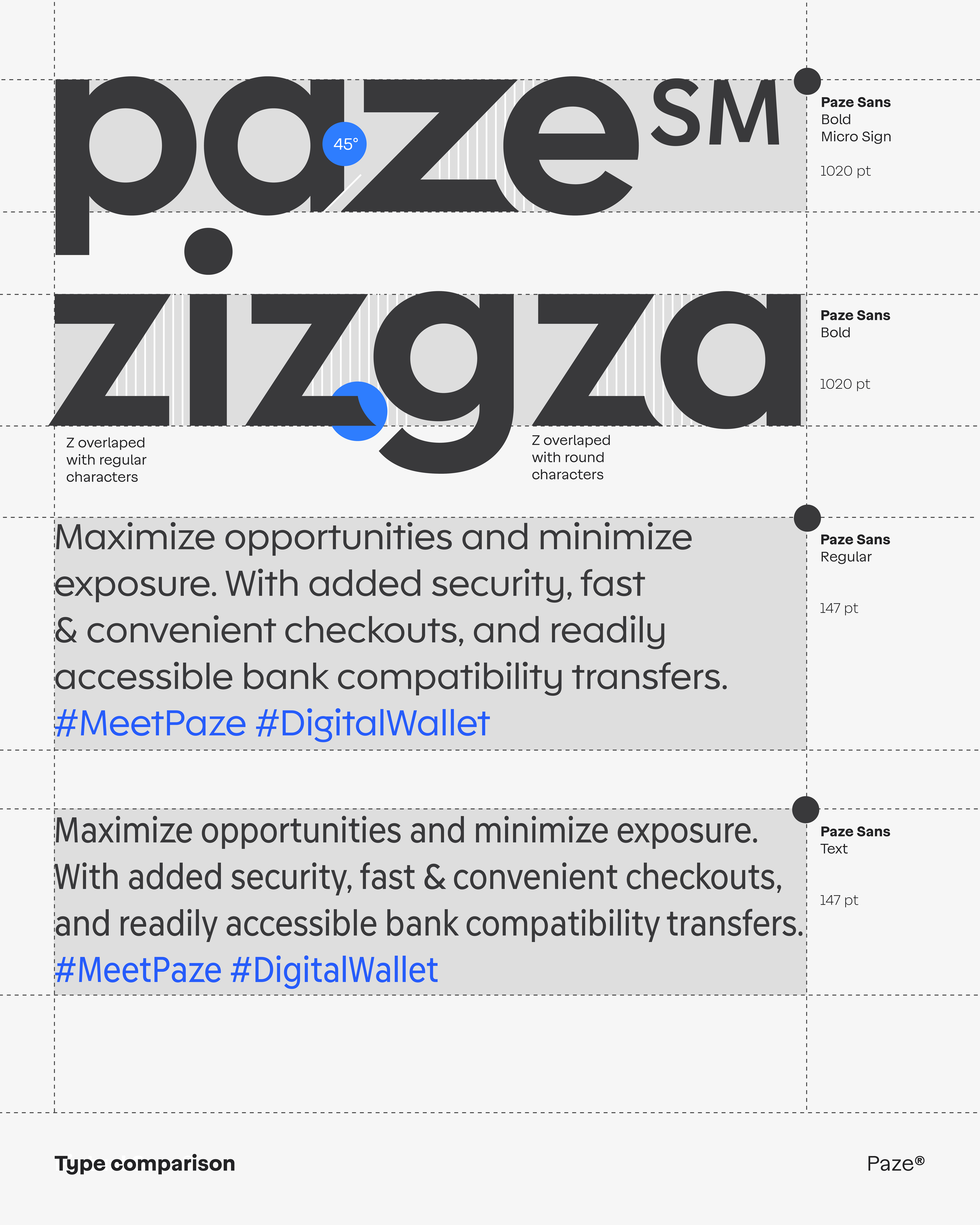
Paze Sans now anchors a visual identity that runs across checkout buttons, mobile flows, out-of-home campaigns, and co-branded placements with McDonald’s, Starbucks, and United Airlines — a custom typeface design built not just for a brand, but for the infrastructure of American digital payments.